
Accordion

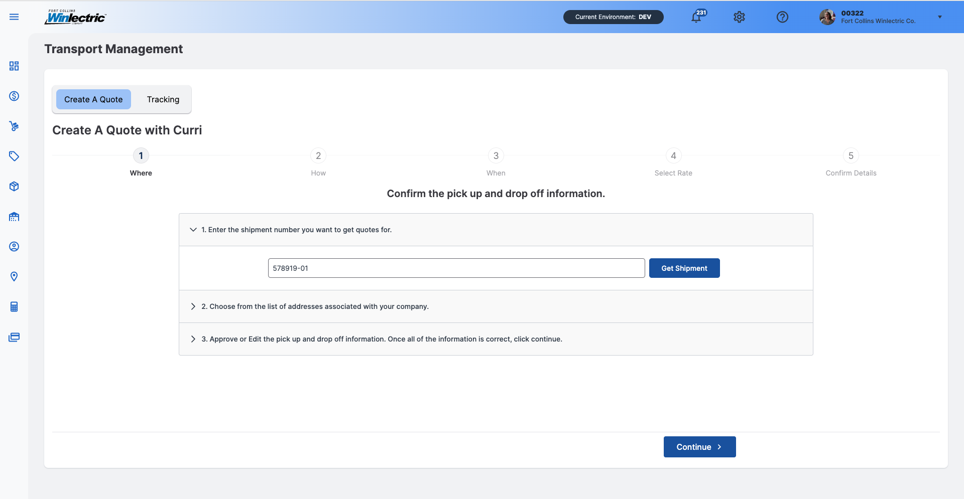
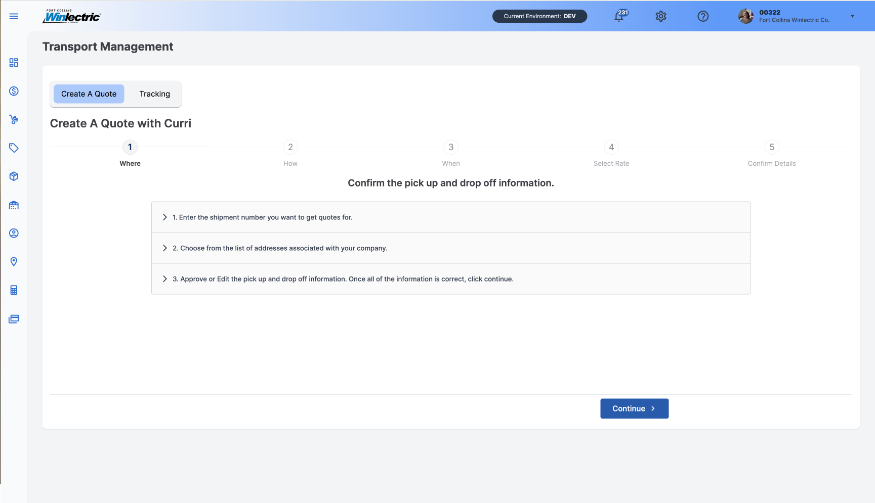
Purpose
A vertically stacked list organized by headers that allow users to reveal or hide associated sections of content.
Usage
When to use
- Organize related information into digestible chunks.
- Shorten pages and reduce scrolling when content is not crucial to read in full.
- Convey an overview of a page.
- Information is restricted to small spaces, such as mobile devices.
- Progressively display content instead of overwhelming the user with all the information at once.
- The main task is a logical, step-by-step process.
- The information in each section is independent and users are unlikely to need simultaneous access to multiple sections.
When not to use
- The user needs most or all of the content on the page to answer their questions.
- There is little content on the page.
- Content has a deep hierarchy with multiple sub-levels.
- Content is scattered and difficult to summarize.
- Users are likely to immerse in a continued flow of reading.
Video Recap
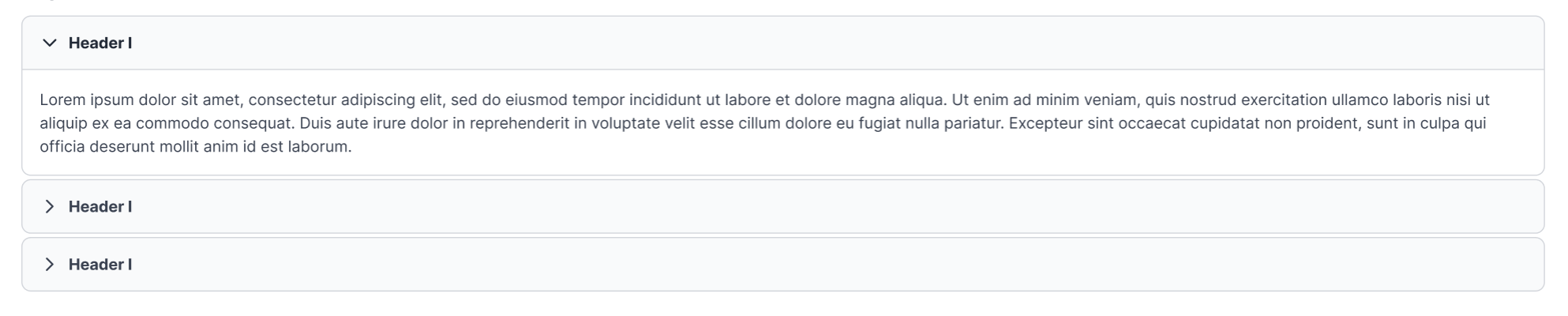
Best Practice
Example One
Ensure that the heading accurately reflects the content within the panel.
Example Two
Allow users to open or collapse multiple sections at a time.
Example Three
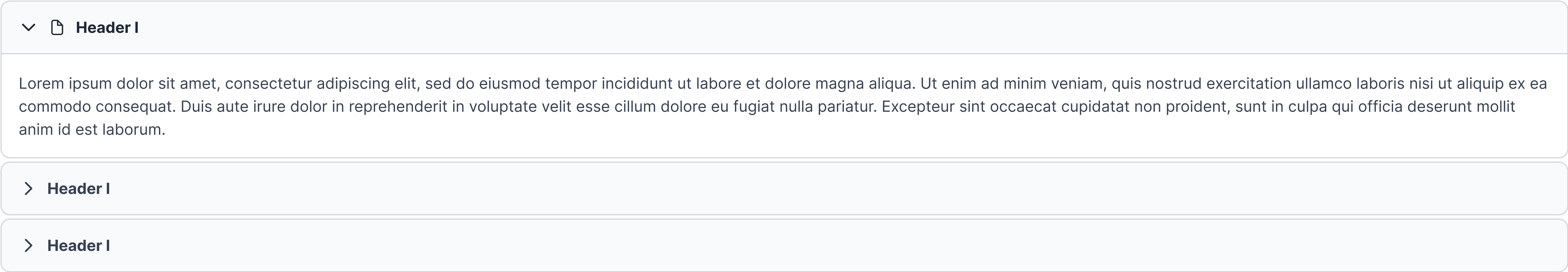
Chevron is positioned on the left side of the header, points down when the accordion section is open, and to the right when the accordion is closed.
Example Four
If using an icon within the header, place it between the chevron and header title.
Winsupply Standards
Incorrect Usage
Example One
Hiding crucial information within collapsed panels.
Example Two
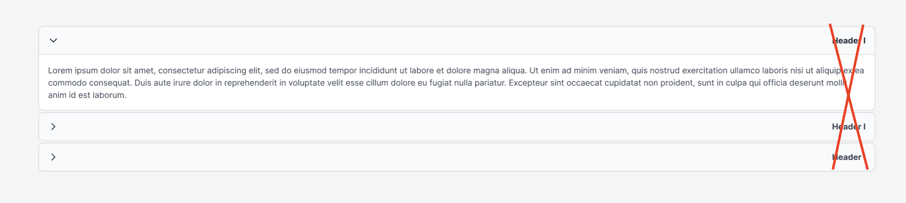
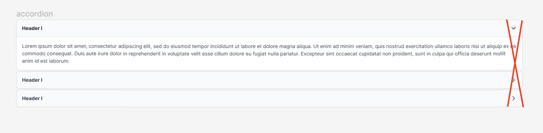
Aligning the header text to the right side.
Example Three
Aligning the chevron to the right side.
Example Four
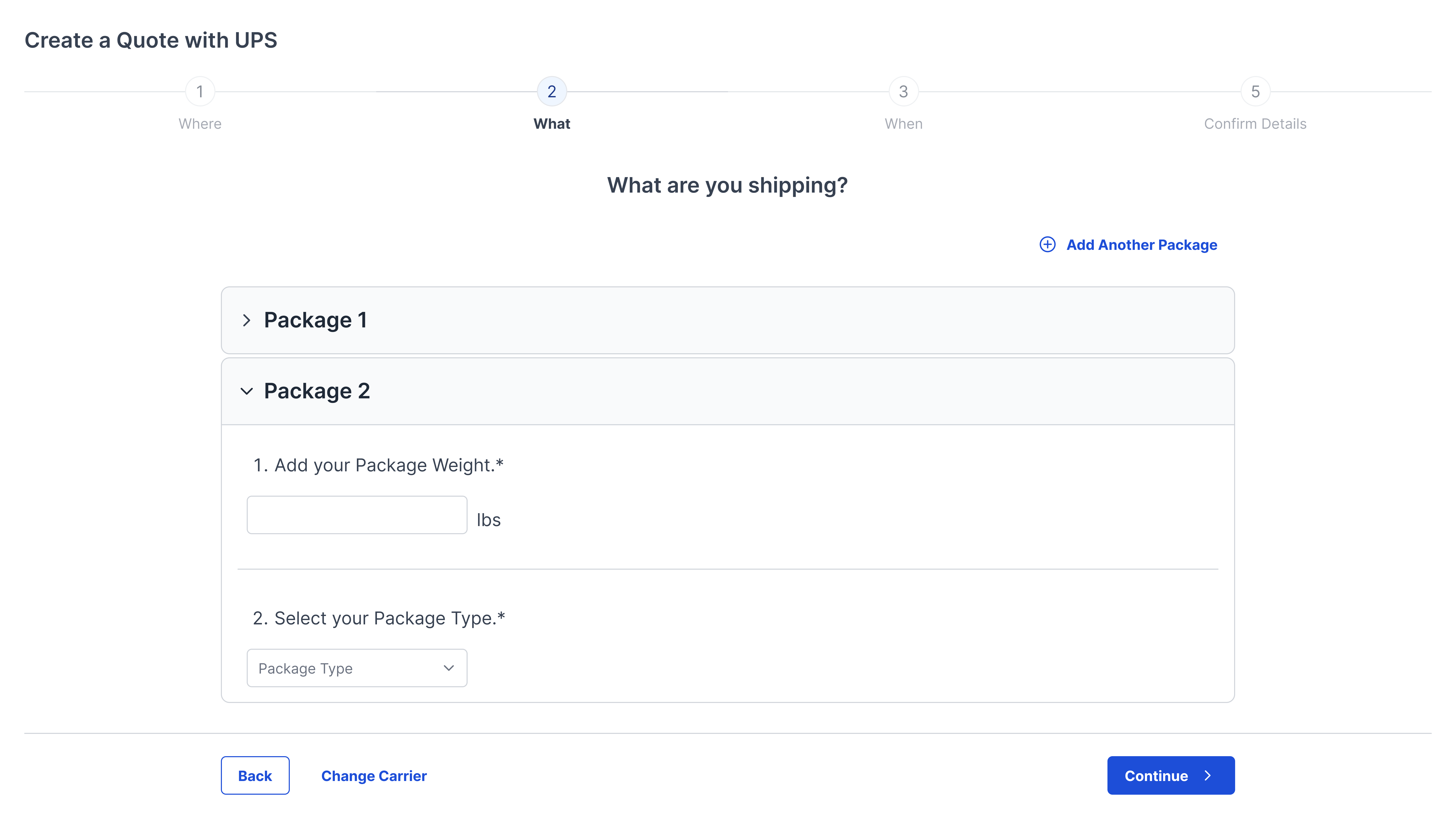
Variants
Sizing
The accordion panel header is 48 px in height with a radius of 8 px and a gap of 8 px. The width varies based on use and location.

The accordion content panel has a radius of 0 px, 0 px, 8 px, 8 px. A border of 1 px and 16 px padding. The width varies based on use and location.
