Button (General)
Purpose
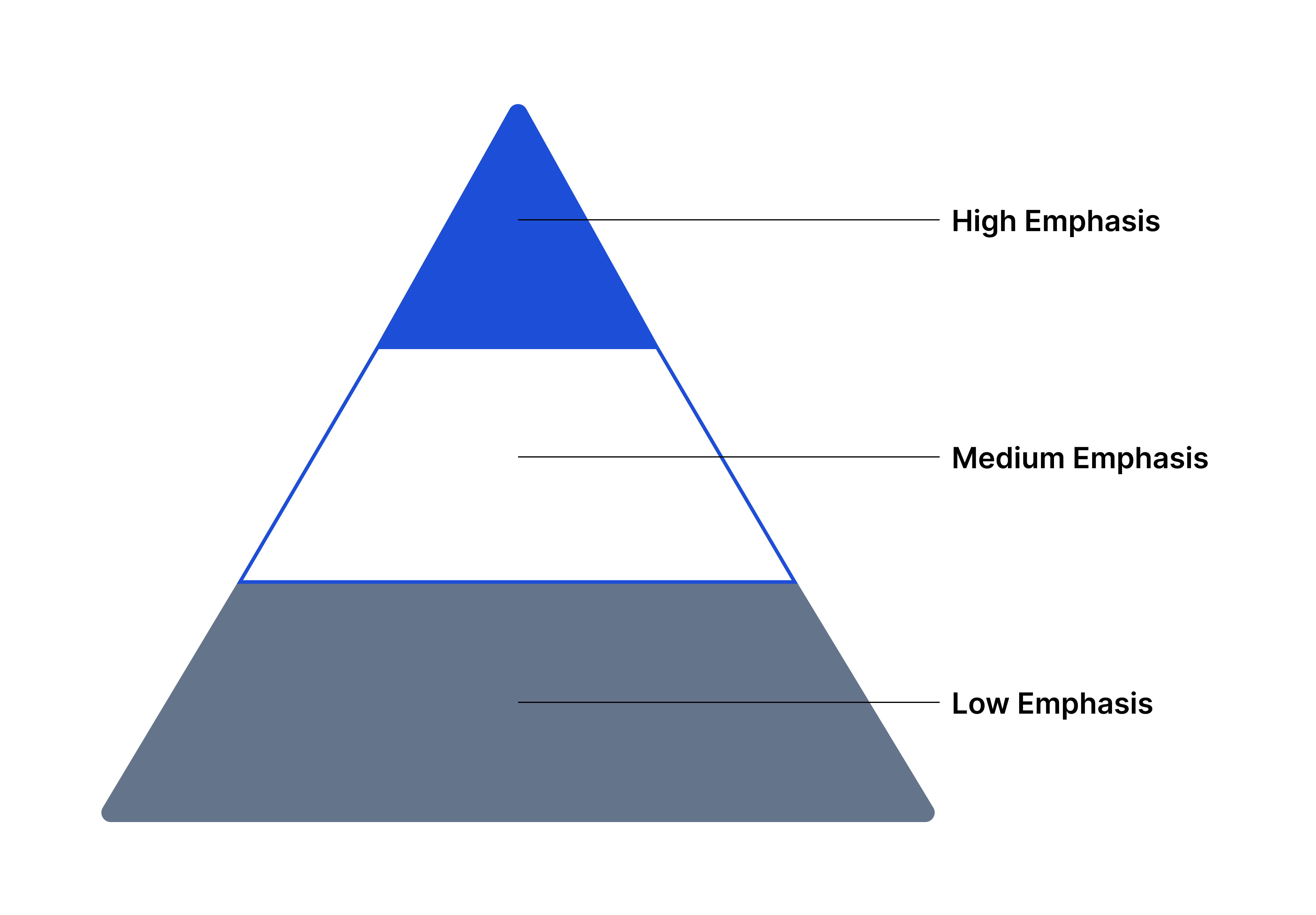
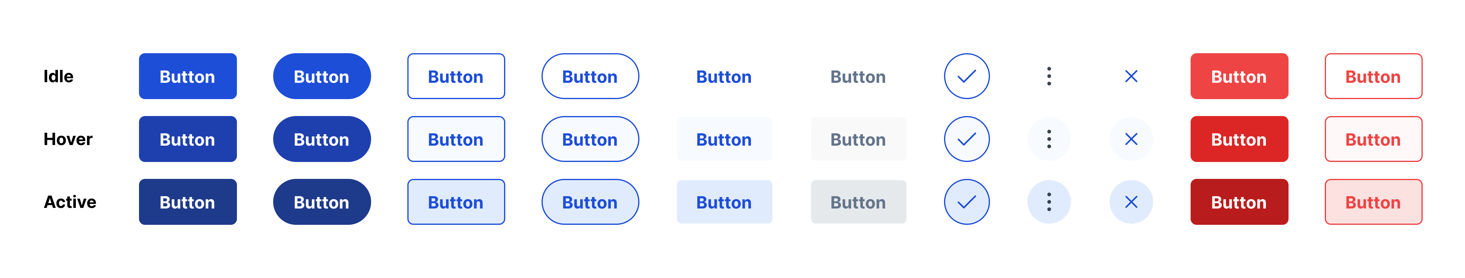
Each type of button enables users to initiate an action or process based on its level of emphasis (high, medium, low). Every button has three states (idle, hover, active) to cue the user that they are clickable, within the right touch target, and the intended action has been initiated.
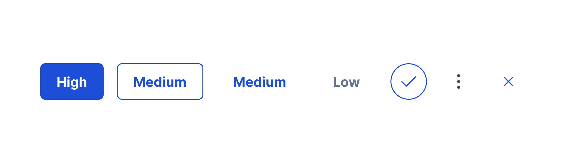
The type of button is based on the level of emphasis of an available action a user can take. Use combinations of the 11 button types to direct a user's attention throughout applications.
Need guidance on choosing the right button? Find your answers here.
Usage
When to use
- Initiate a primary action
- Initiate supplemental actions
- Begin a process
- Enable users to complete tasks and edit/change data
When not to use
- Action is not required or necessary
Video Recap
Best Practice
Example One
If placing an icon within a button, place the icon to the left of the button label. Icons must have the same meaning across applications (Ex. funnel = filter)
Example Two
If buttons are left aligned, place the primary button on the far left. If right aligned, place the primary button on the far right.
Example Three
If a destructive button is not the primary action and is grouped with more than two buttons, make it an outlined destructive button (medium-emphasis) and place it away from the other two actions. If the destructive button is the primary action, make it Primary Destructive (high-emphasis) and place it in the primary button space.
Example Four
On mobile, place buttons on the bottom of the screen to account for faster flow and natural movements of the thumbs, especially when the user is holding a phone one-handed. If two buttons are needed, stack them and place the primary button below the medium or low-emphasis button.
Winsupply Standards
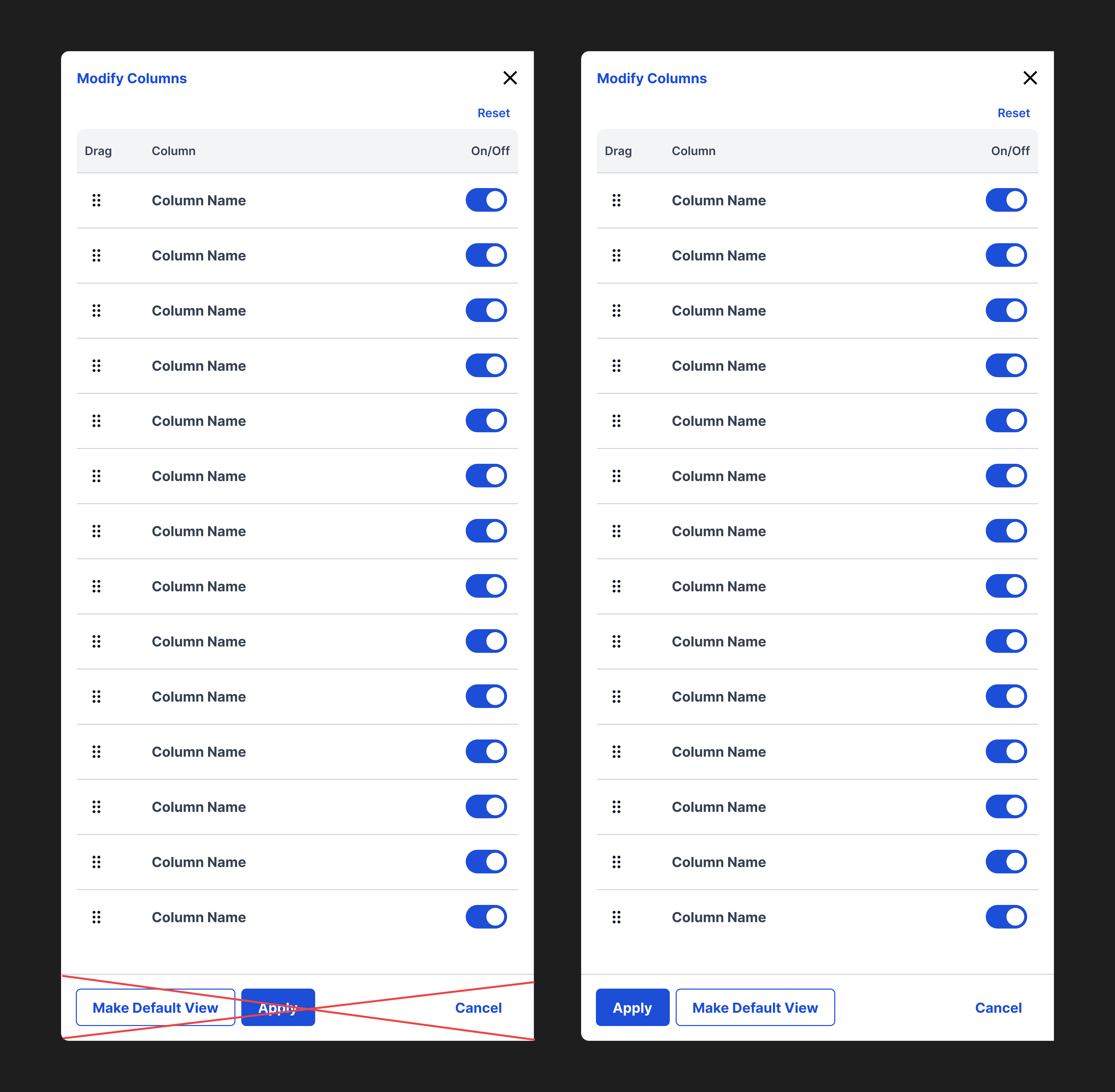
Incorrect Usage
Example One
Buttons do not follow the proper hierarchy.
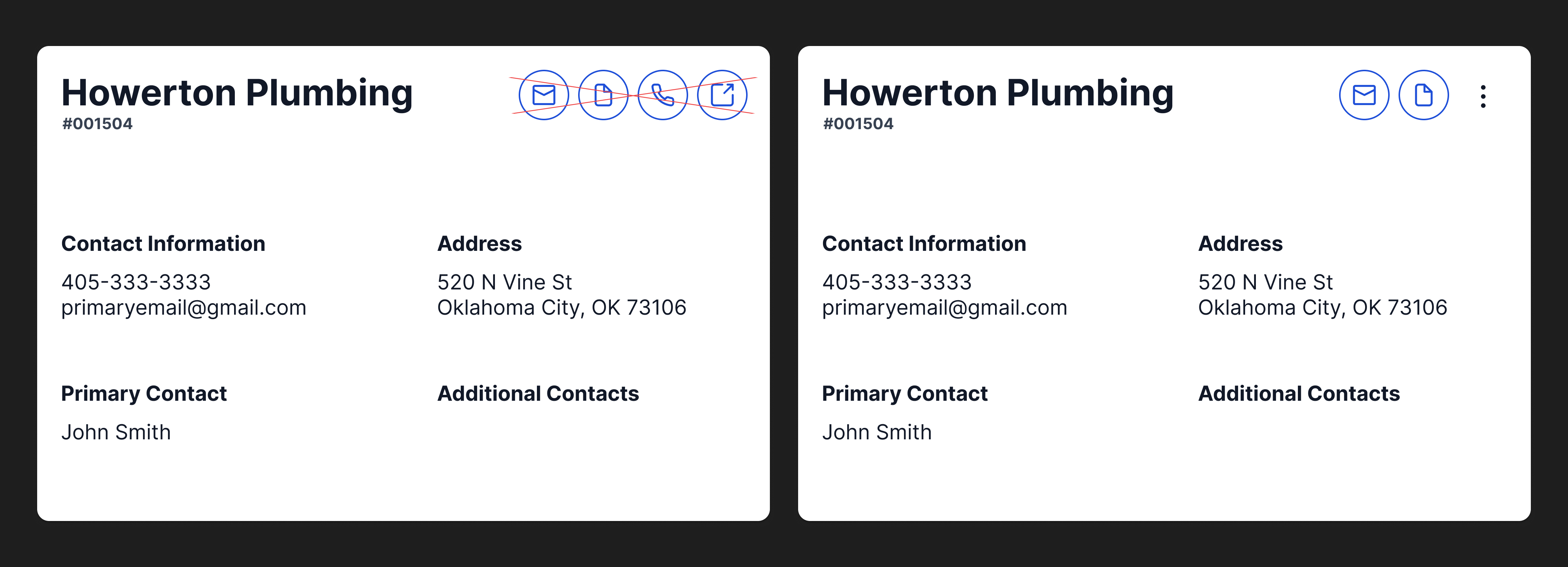
Example Two
More than two buttons are placed next to one another. Instead, use the ellipse rounded icon button with a dropdown to house additional secondary and tertiary actions.
Example Three
Example Four
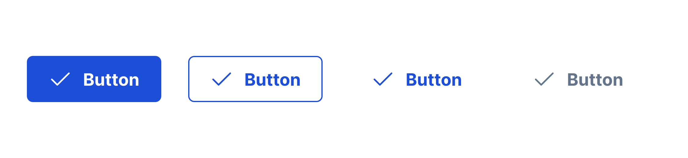
Variants
Button with icon
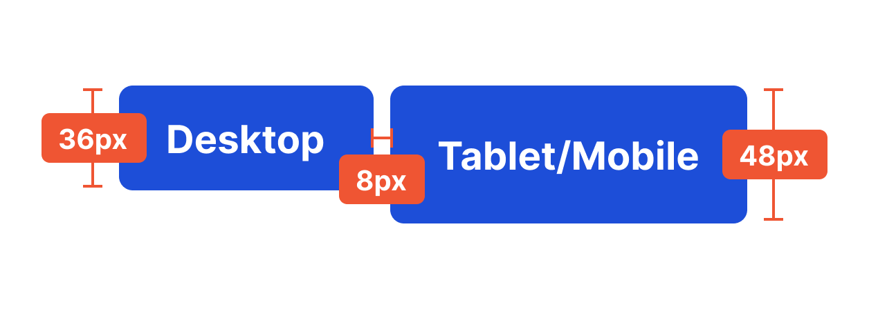
Sizing
Height (Desktop): 36px, Height (Tablet/Mobile): 48px, Margin: 8px