
Color
There is more to making an interface look visually appealing. Color brings guidance, communication, and uniformity to users, providing them with a consistent and comfortable experience across the WISE environment.
When you think of Winsupply, the vibrant blue that comes to mind is a testament to our brand's identity.
Blue communicates trust, loyalty, and integrity, which is the center of what Winsupply represents: Empowering the Spirit of Opportunity while local companies place their trust and loyalty in us.
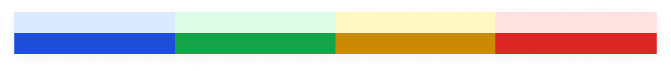
Color Palettes
Theme
Our primary blue theme indicates action and adds subtle additions of color to emphasize Winsupply's branding throughout WISE.

Surface
Neutral background colors, such as white and gray, layer over one another to create areas of distinction for content.


Typography
A dark and medium gray distinguishes hierarchy and allows text to stand out against the background. Depending on the background, text color can change to accommodate accessibility standards.

Messaging
Specific colors assigned to communicate status to a user.
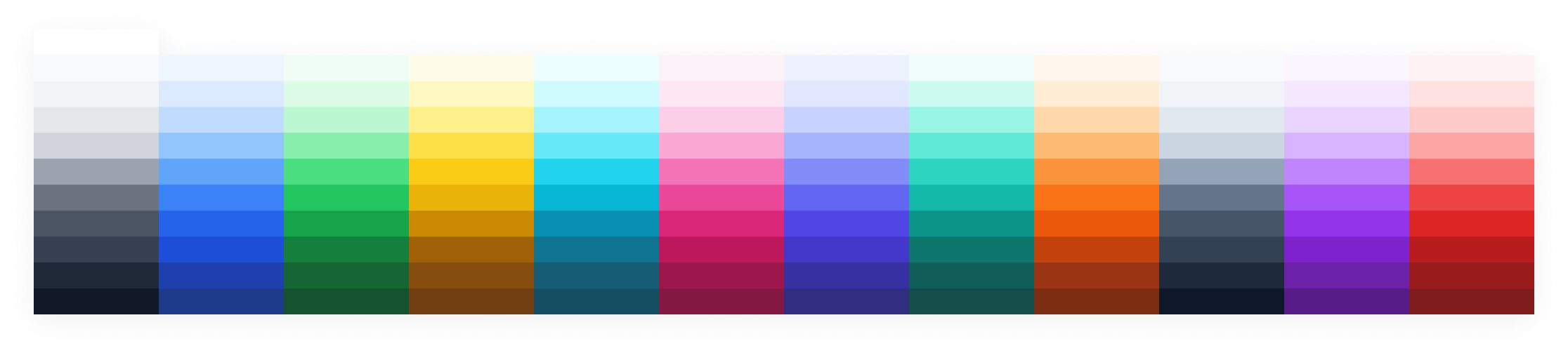
Base
All colors that make up the varying tokens we have in our library. Every token links back to a base color and its hex code. The lower number indicates a lighter shade, whereas the higher number indicates a darker shade. Starting with 50 (except for Surface, which starts at 0 and then increases to 50), then shifting to 100, each shade increases by 100, or one step, until reaching a maximum value of 900.
Naming Structure
Tokens: Why use them?
Tokens are the smallest pieces of a design system. They are repeatable design decisions used as a communication tool between design and development. As of now, we utilize color tokens (more tokens will be available soon).
For example, a design decision is made, such as the background color of a primary button. It is then translated into a token to be maintained at a global level (the button background color can be changed on all files at once instead of editing in individual files). The design can then be easily implemented by developers, due to the token being connected to the appropriate hard-coded color value.
Types of color tokens
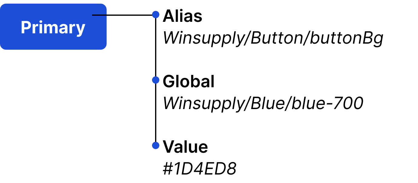
Alias
Names the intended role of that token and are the building blocks of a component. These tokens should be primarily used in designs to communicate the role of the color within a component and to accommodate for light and dark mode.
Global
A token that represents the base color. These tokens may be used in designs, but are to be used sparingly, due to accommodating light and dark mode switching.
Value
Hard-coded data associated with a token.
Light vs. Dark Mode
Light and dark mode gives users the option to view WISE in a predominately light or dark color palette. Light mode is familiar and makes readability easier, while dark mode is considered trendy and reduces eye strain. Whether a user's decision is based on aesthetic or how they best view an interface, providing both options supports accessibility.
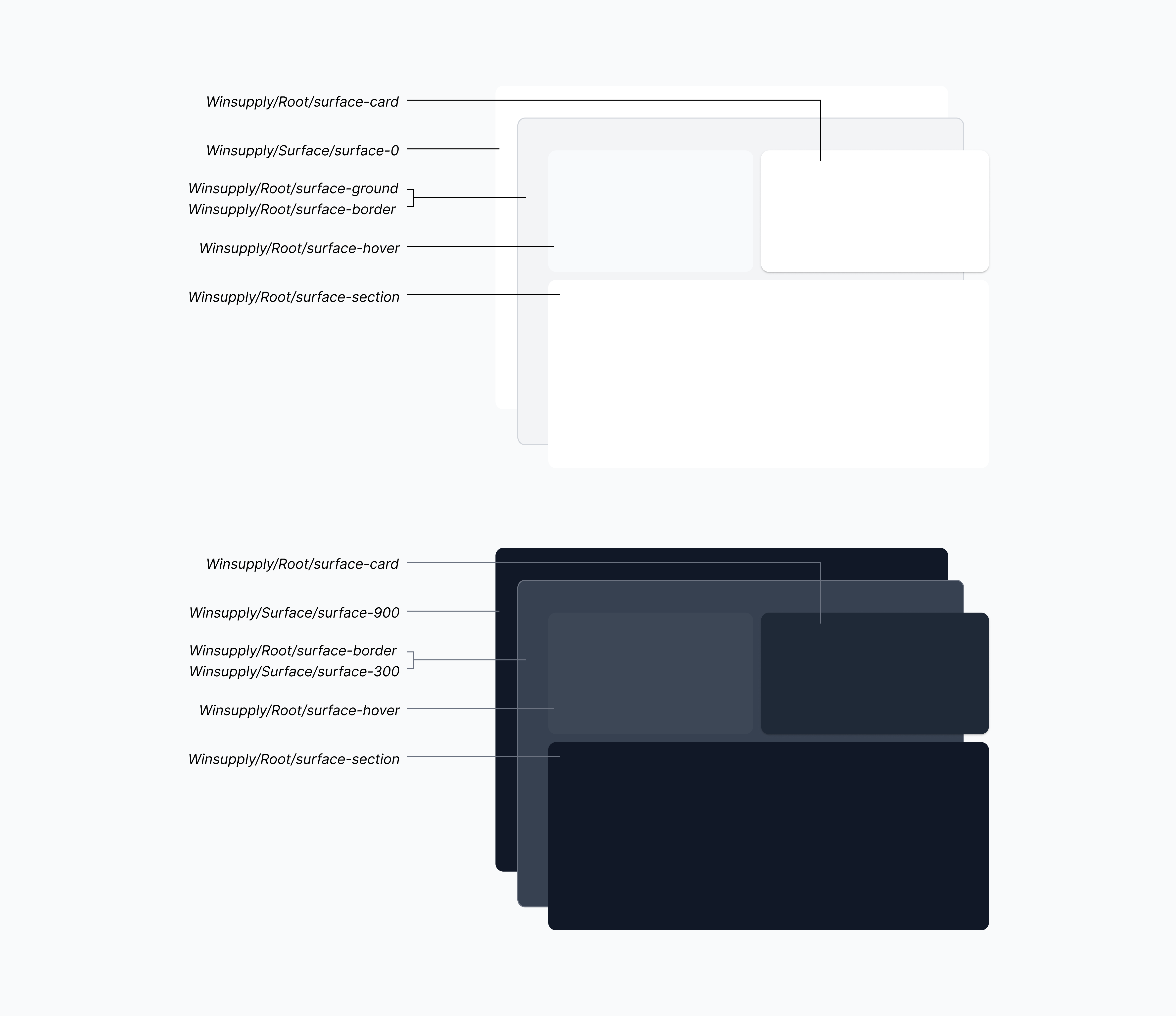
Light mode
Content container background
Alias: Winsupply/Root/surface-ground
Global: Winsupply/Surface/surface-100
Value: #F3F4F6
Dark mode
Content container background
Alias: Winsupply/Root/surface-border
Global: Winsupply/Surface/surface-100
Value: #374151
Color Application
A majority of the colors throughout WISE should be applied with intention, seamlessly guiding users through processes and tasks while aiding in readability of content.
Background layering
In light mode, a layering of light grays and white creates dimension between the background and foreground of the interface. In dark mode, dark and lighter grays shift between one another.
Navigation
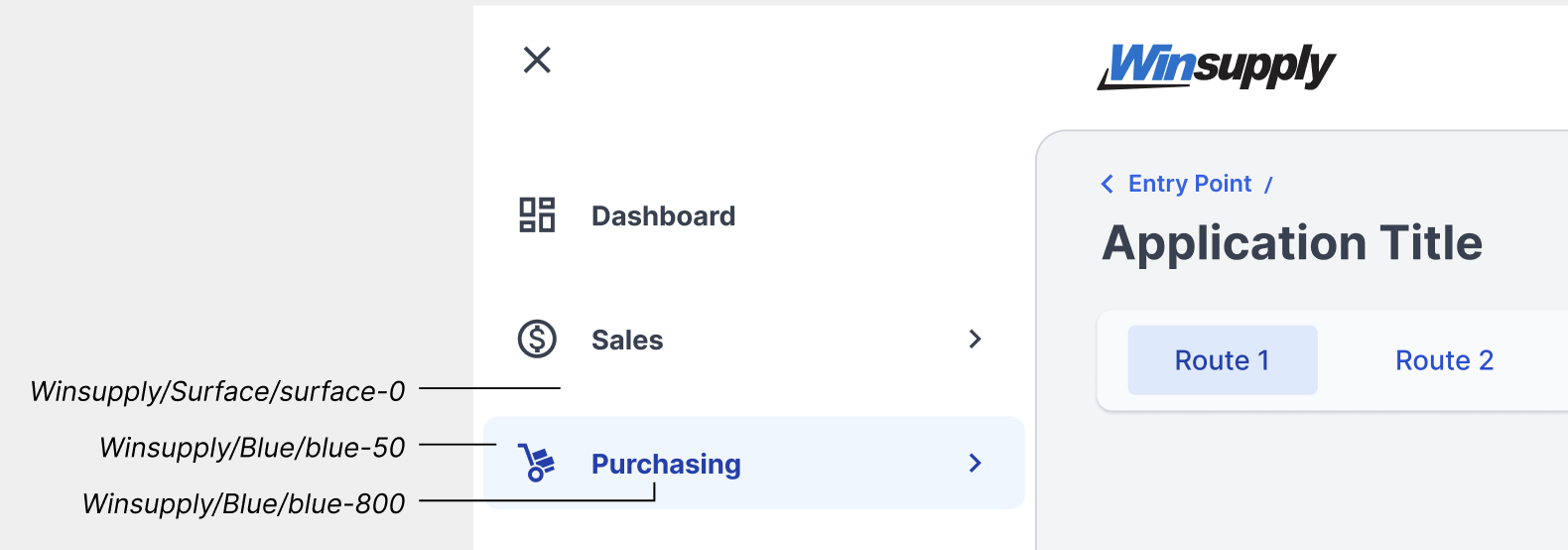
Primary
The first level navigation menu sits on a Winsupply/Surface/surface-0 background and each navigation item is Winsupply/Global/textColor. On hover, text switches to Winsupply/Blue/blue-800 with a Winsupply/Blue/blue-50 background. When shifting from the second-level navigation to the third, Winsupply/Surface/surface-100 distinguishes the deepest navigation menu a user can reach. Within this menu on hover, text is Winsupply/Blue/blue-700 on a Winsupply/Surface/surface-50 background, and when selected, text is Winsupply/Blue/blue-800 and background is Winsupply/Surface/surface-0.
First-level navigation
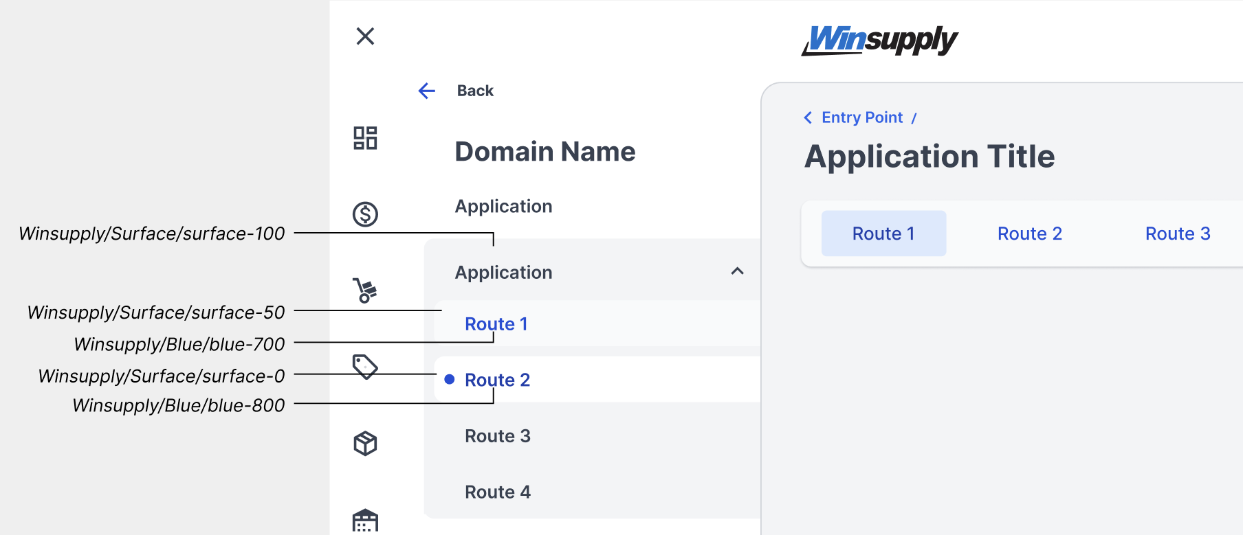
Second-level navigation
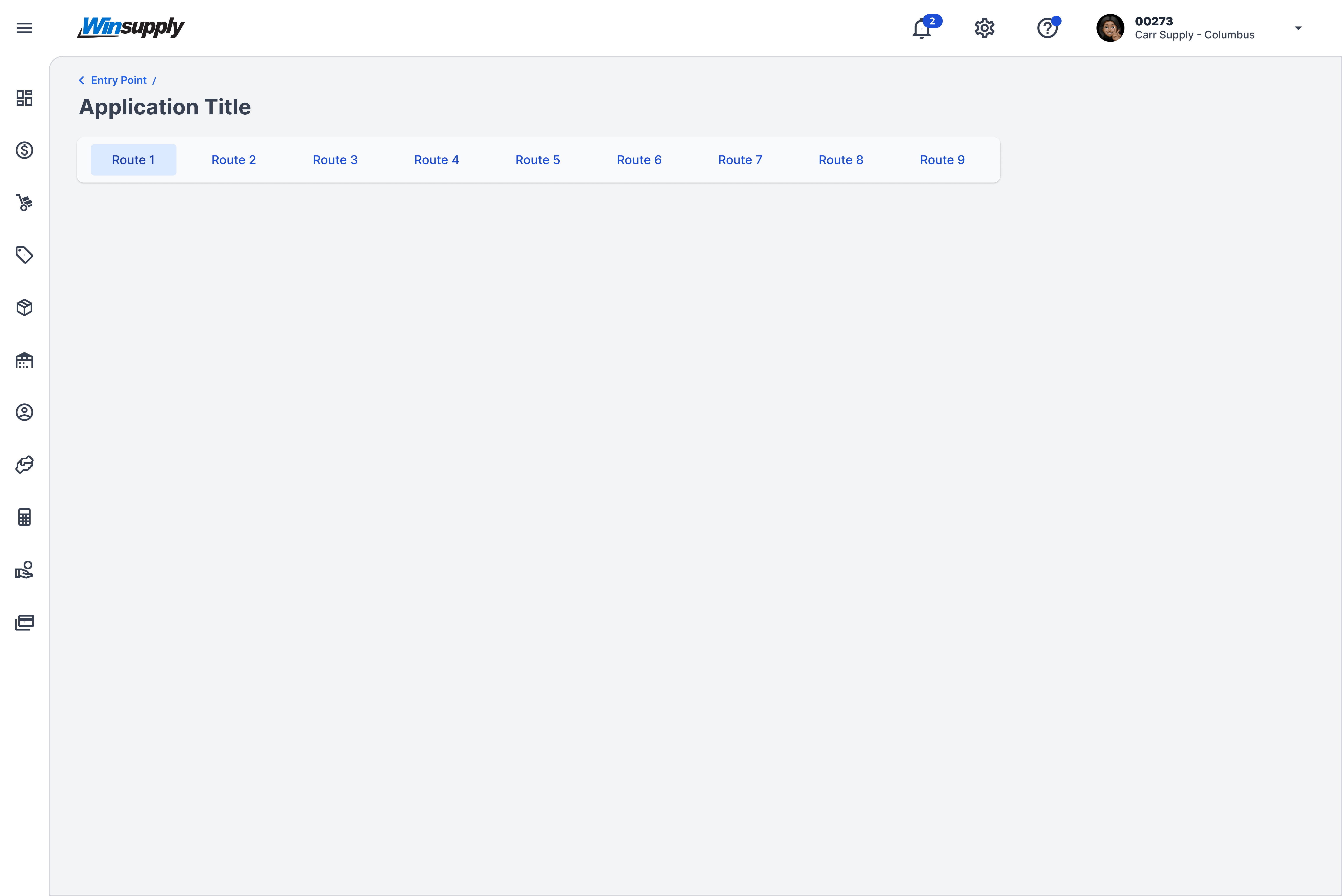
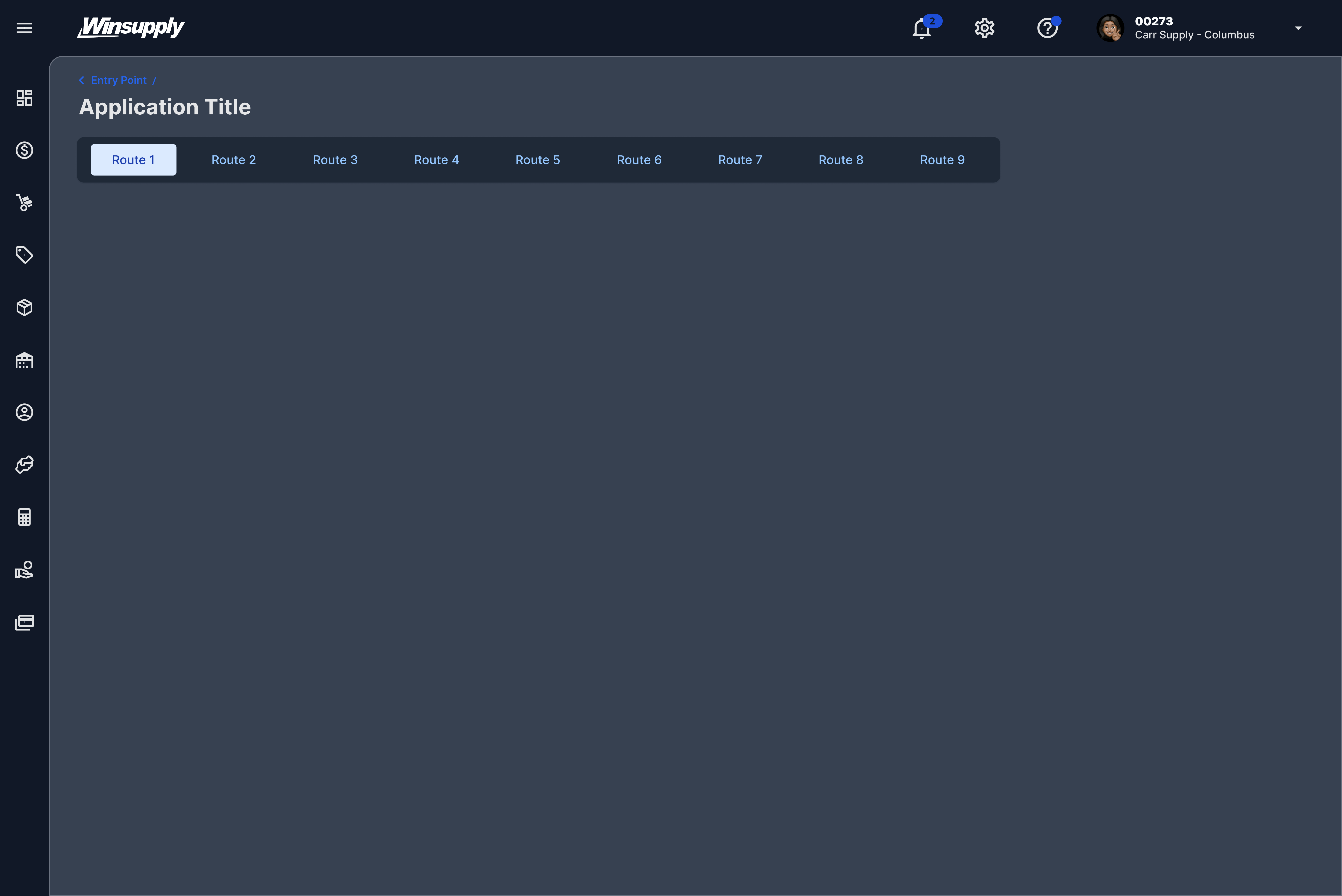
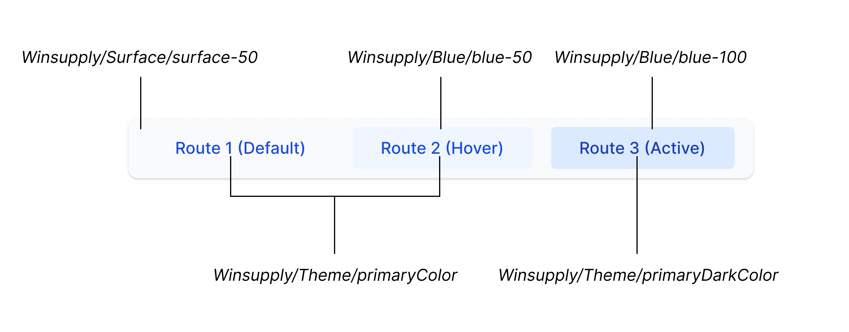
Application routing
In its default state, the container is Winsupply/Surface/surface-50, and the route labels are Winsupply/Theme/primaryColor. On hover, the route backgrounds are Winsupply/Blue/blue-50, and when active, they switch to Winsupply/Blue/blue-100, and the labels switch to Winsupply/Theme/primaryDarkColor.
Typography
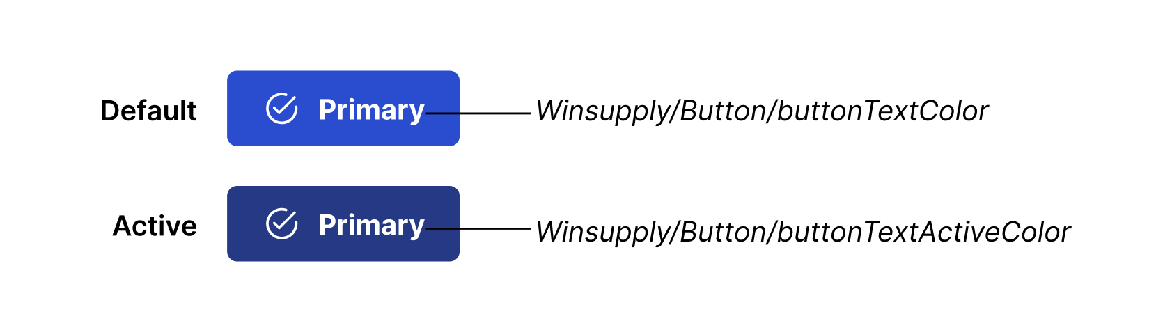
The two main color choices for type are Winsupply/Global/textColor and Winsupply/Global/textSecondaryColor. As referenced within the Color Palettes section, depending on the background, text color can change to accommodate accessibility standards. For example, if text is on a primary button, the color is Winsupply/Button/buttonTextColor (#FFFFFF) to meet WCAG 4.5:1 contrast requirements. Tokens will contain -TextColor or -Text(State)Color in their naming. (Ex. Winsupply/Button/buttonTextActiveColor).
Note: Do not place colors other than Winsupply/Global/textColor, Winsupply/Global/textSecondaryColor, or Winsupply/Blue/blue-600 (see Color section in Typography) on standalone text outside of a component. This could compromise readability.
States
Hover
A subtle cue to the user that an element is interactive by changing the background color to a darker shade. Tokens will contain -hover in their naming.
Active
Demonstrates an interactive element, such as a button, has been clicked, tapped, or pressed down. Tokens will contain with -active in their naming.

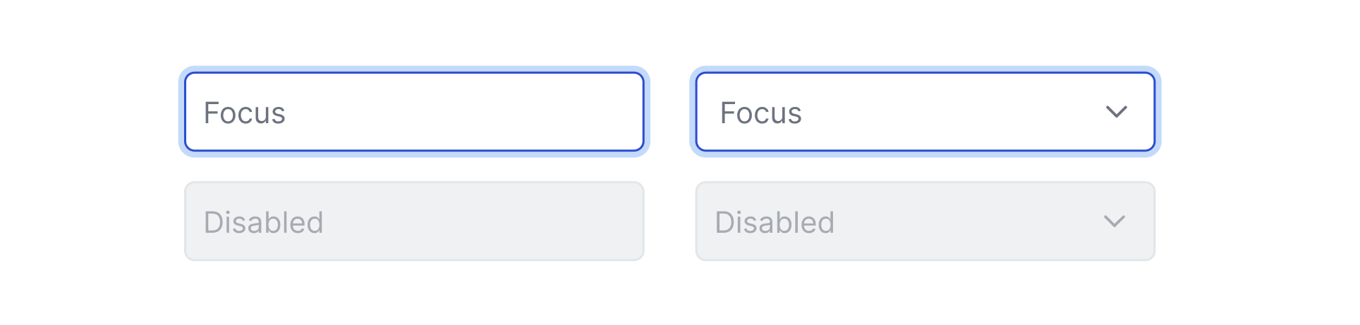
Focus
Highlights an interactive element and is primarily utilized when a user is navigating via their keyboard or voice. Tokens will contain -focus in their naming.
Disabled
Shows the user is not able to interact with a component. If using a disabled component, apply 60% opacity. For example, if making an input field disabled, apply 60% opacity to Winsupply/Input Field/inputFilledBg.
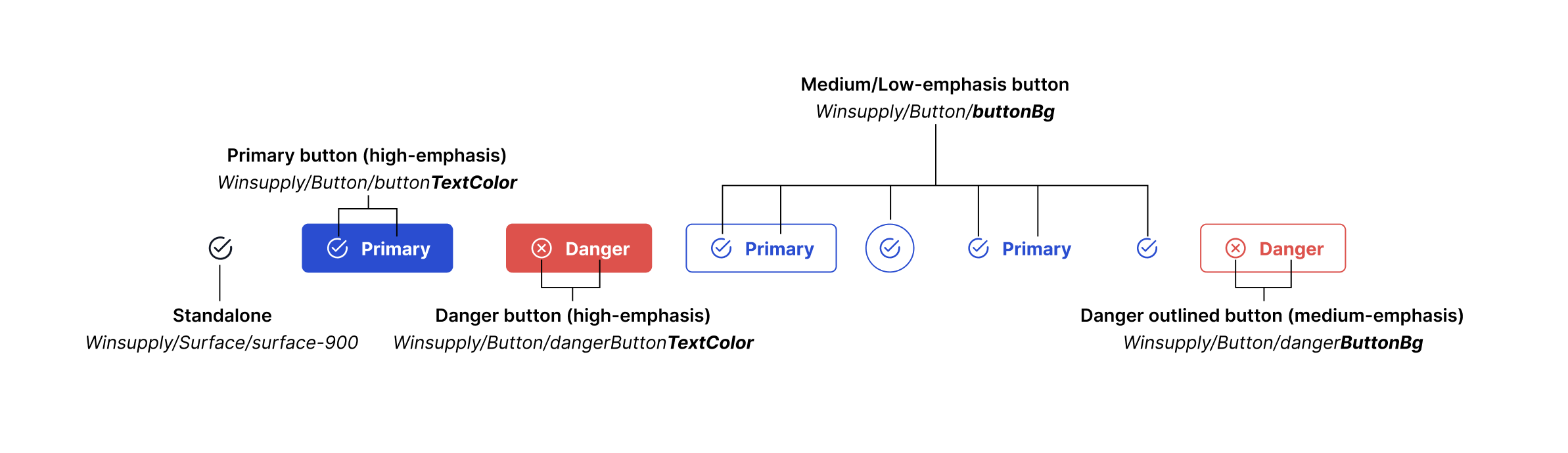
Icons
Standalone icons are Winsupply/Surface/surface-900 (#111827), but if placed within a filled (high-emphasis) button or component, color tokens will contain -TextColor. If within a medium or low-emphasis button (outlined or text-only with no background), color tokens will contain -ButtonBg. For consistency and accessibility, an icon must match the label color within a component.
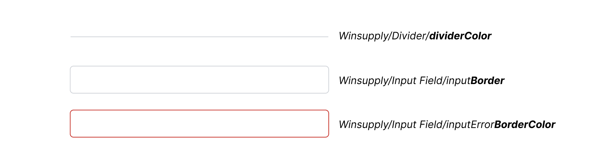
Border
Distinguishes an element, such as an input field or a divider, from the background, creating spaces for users to input information or create sections for content. Tokens will contain -dividerColor,
-Border, -BorderColor.
Accessibility
Color accessibility is essential for all users to view WISE and its UI design elements effectively. Different size text must meet WCAG 2.1 contrast ratios:
- Normal text: 4.5:1
- Large text (18px/bold and larger): 3:1
- Incidental text (pure decoration): No requirement
If further guidance is needed, please refer to the Accessibility page.