
Calendar (Date Picker)
Input component to select a date.
Purpose
Calendar (date picker) enables a user to choose a date, date range, and/or time via pop-up or inline to aid in filtering and scheduling functionalities.

Usage
When to use
When not to use
Video Recap
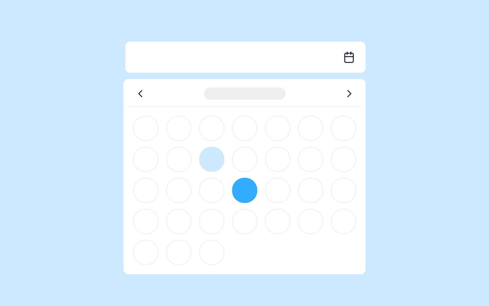
Best Practice
Example One
Date range gives more flexibility for a user to choose a single date or a range of dates within the same input field.
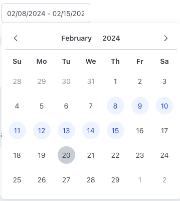
Example Two
Include the day of the week (Format: Day, DD/MM/YYYY) if a user needs to know when a date falls (ex. Scheduling a delivery).
Example Three
Example Four
Winsupply Standards
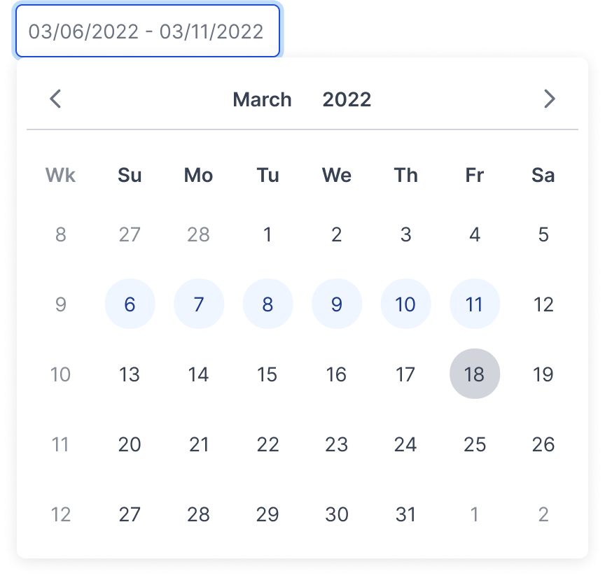
Incorrect Usage
Example One
If using the calendar icon, place it on the right side of the input field.

Example Two
General date format should be MM/DD/YYYY.

Example Three
Example Four
Variants
Range
Time

Multiple Months

Inline

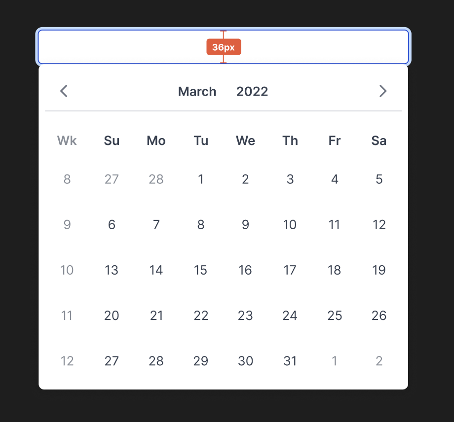
Sizing
Input field height desktop: 36px
Applications In Use
No items found.