
Sidebar
Purpose
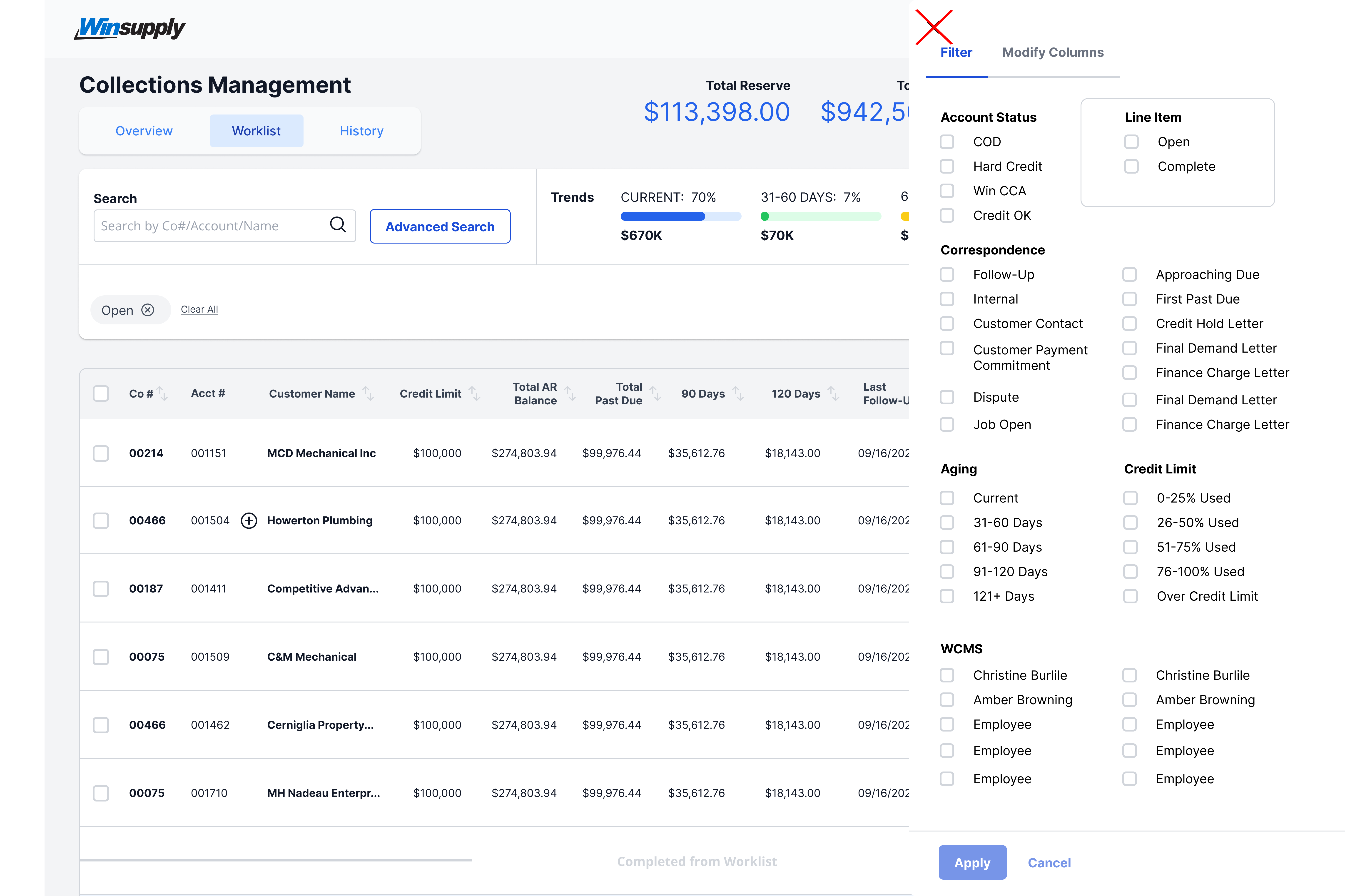
A sidebar is an overlay component that provides supplementary editable and/or static information. Once content has been edited, changes are reflected within the sidebar and/or within another area of the application (Ex. Within Collections Management, marking a worklist line item "Complete" in the sidebar, moves said line item to the "Completed from Worklist" section of the associated table). This component provides animation, a close button, consistent padding, and title positioning. Sidebars are optional and can be used at the designer's discretion.

Usage
When to use
- Expand content in a table and complete tasks while keeping the user within the same screen
- Table filtering and sorting
- A user needs to take action in 3+ ways (email, notes, status, save, complete, etc)
When not to use
- All necessary information exists in one view
- Additional actions could be handled by a single interaction
Video Recap
Best Practice
Example One
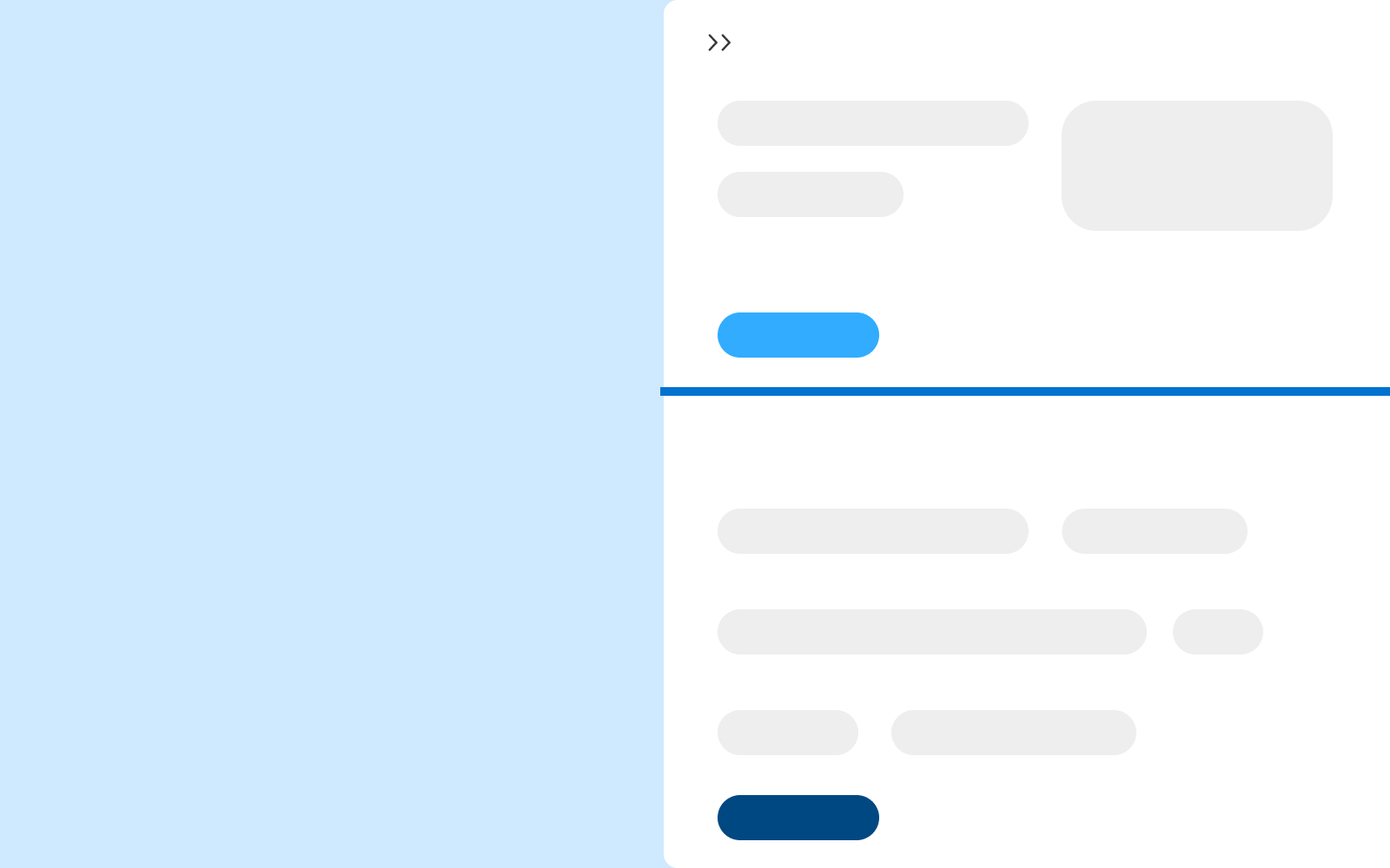
Each sidebar should consist of a header area that could include actions like: collapse, break out into modal, expand full screen and more. This top area should exist for a title, or reference to why the user is within the sidebar area.

Example Two
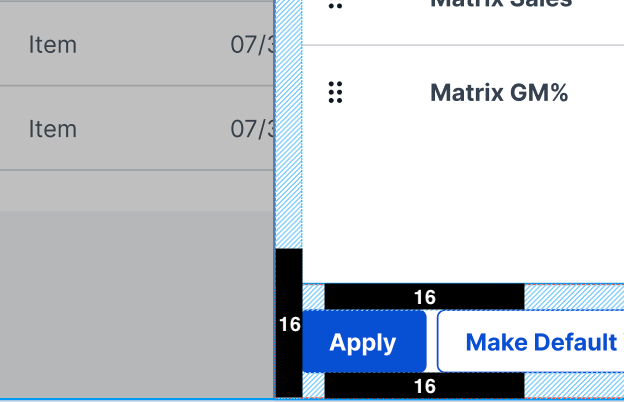
Maintain 16px of padding between elements within.
Example Three
Example Four
Winsupply Standards
Incorrect Usage
Example One
Placing the close "X" icon in the top left.
Example Two
Opening from the left side of the screen.

Example Three
Example Four
Variants
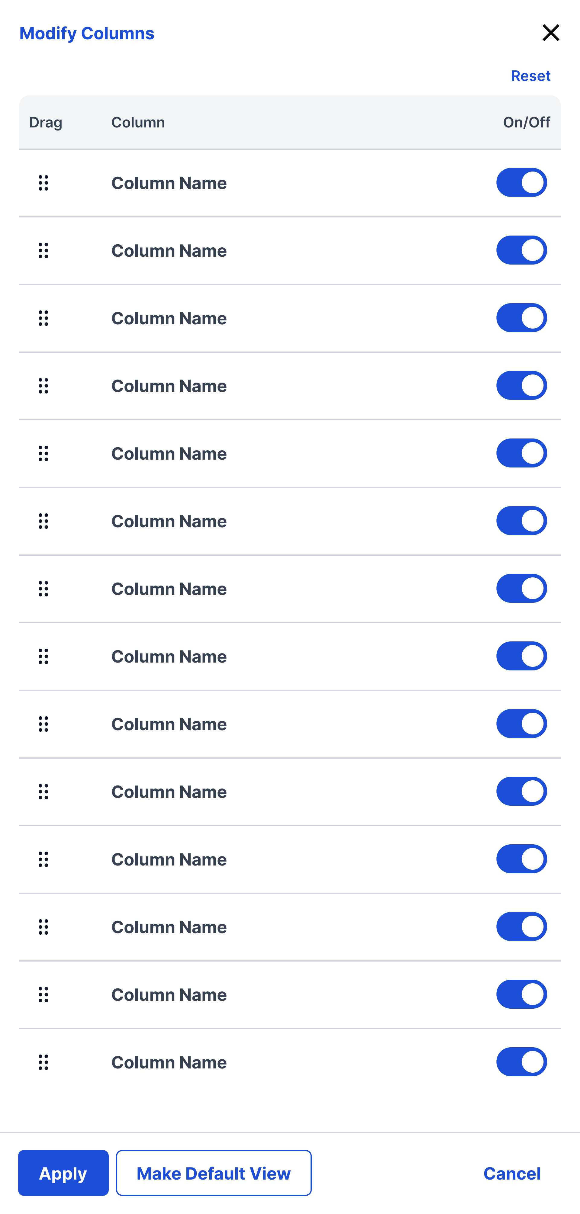
Modify Columns (Dev in progress)
Sizing
Minimum Width: 480px Max Width: 700px or less than half of the screen.
