
Data Visualization
Communicate complex information in a visual way by using graphs, charts, trends, and/or maps.
What is the purpose of the data?
Ask yourself this question before choosing which type of data visualization to pair with the corresponding data set.
Comparisons
Measure the differences between two variables and/or groups of data.
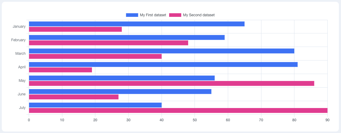
- Simple bar graph
- Grouped bar graph
- Stacked bar graph
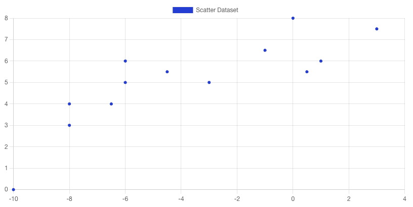
Correlations
Observe relationships between variables and how they could aid in predicting future data/trends.
- Scatter plot
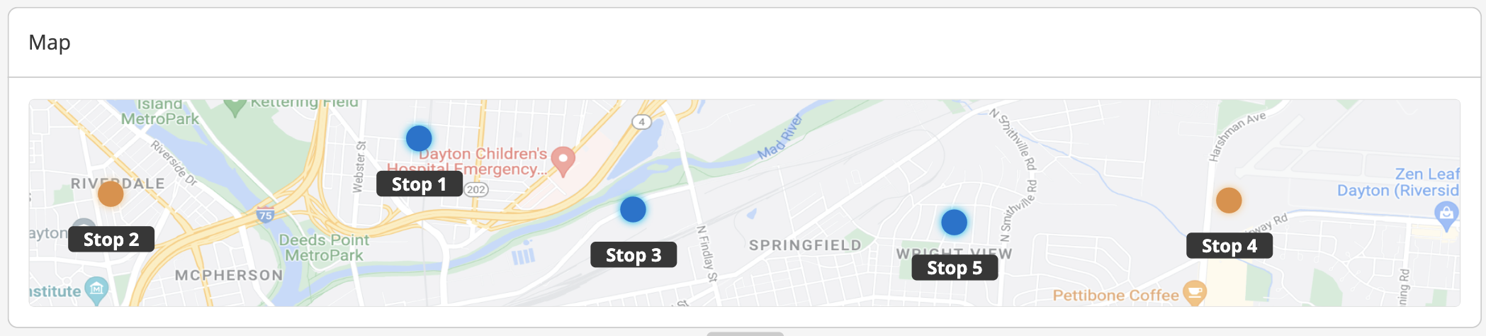
Geographic
Show a user where a location is on a map. This aids in tracking data such as shipments and deliveries.
- GPS map
- Connection map
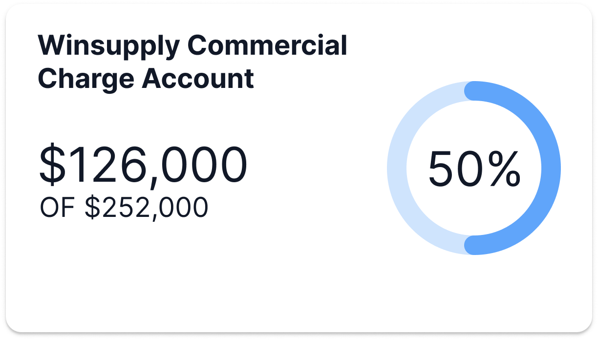
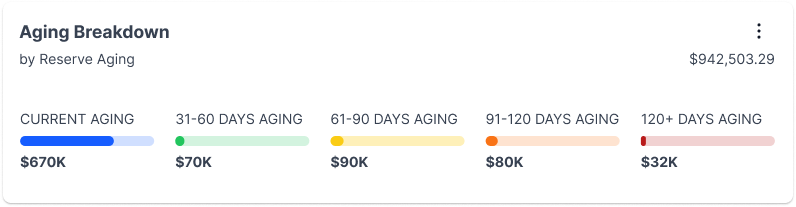
Part-to-whole
Separate pieces of data into sections that represent parts of a whole.
- Pie graph
- Doughnut graph
- Progress bar
- Polar area
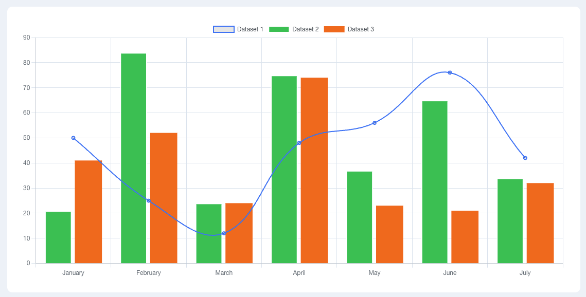
Mixed
Display different types of data visualization in one chart or graph if there are multiple purposes the data can fulfill.
- Line + bar chart
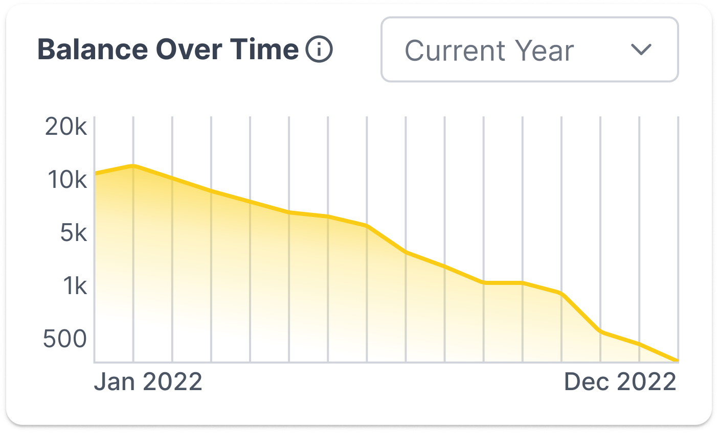
Trends
View how data changes over time.
- Line graph
Best Practice
Ensure users can easily break down the data they are presented.
Labeling
Consistent, concise labeling of axes and legends will aid in "telling the story" and help the user comprehend the representation of data.

Do


Don't
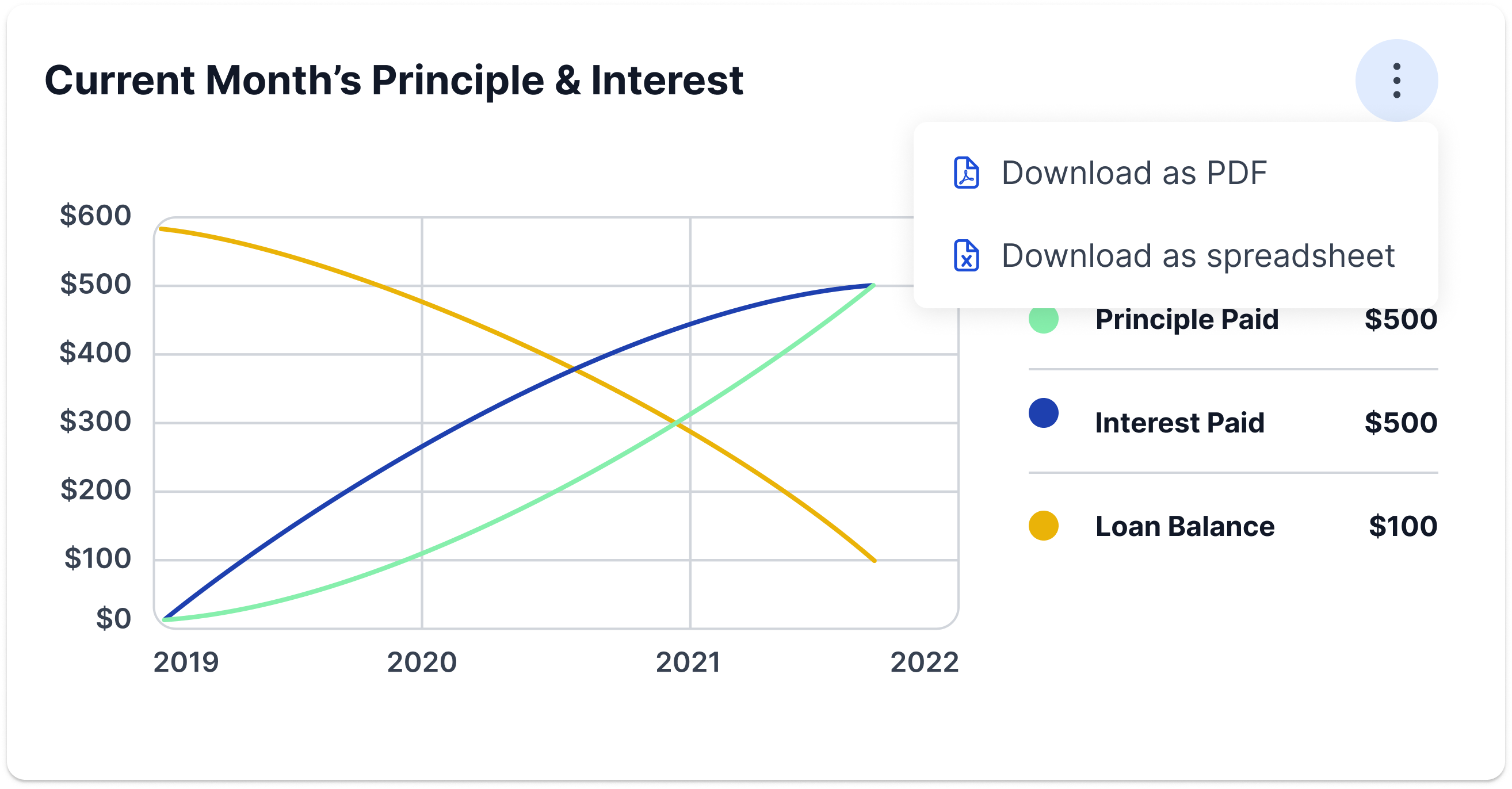
Supplemental format
Some users prefer an analytical text-based approach. Consider adding an alternative view by enabling a user to download a spreadsheet.
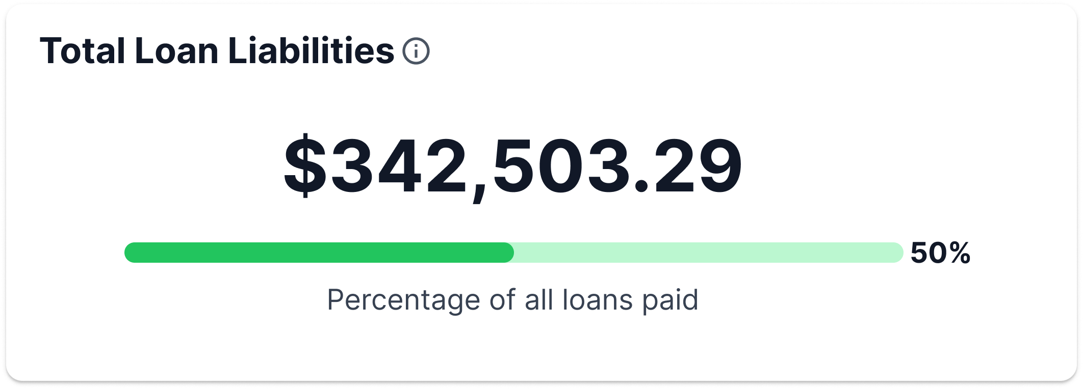
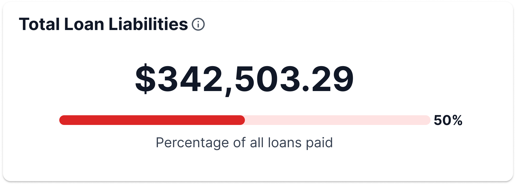
Color usage
Part of communicating data is through use of color. Think of how a user may interpret color and how it will affect motivation and/or goals. Correlate color palettes with our messaging colors in the PrimeOne library or WinNG color library to show status.
- Green: Success (or positive)
- Blue: Neutral and/or informational
- Yellow: Warning
- Orange: Warning and/or nearing danger
- Red: Danger (or negative)
Do
Don't
Accessibility
It is the designer's and developer's responsibility to cross-check color contrast, text scaling, and alt text so all users can read and understand this form of data communication. Visit the Accessibility section to understand all of our standards.
Developer Tool
There are no specific chart components in PrimeNG or WinNG. They are based on Charts.js 3.3.2+, an open source HTML5 based charting library.