
Dialog (Modal)
Container to display content in an overlay window.
.jpg)
Purpose
Modals are a flexible container used to display information or additional content on top of an application's surface.
Usage
When to use
- Bring the user's immediate attention to an important detail or issue
- Confirming changes
- Warnings based on an action (ex. "Are you sure you want to delete? This cannot be undone.")
When not to use
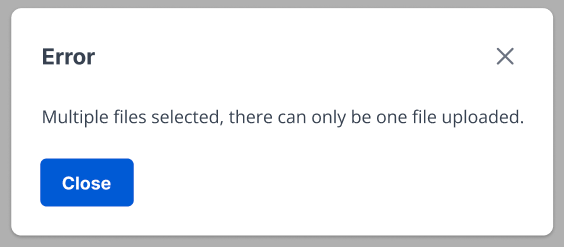
- Providing error or success messages
Video Recap
Best Practice
Example One
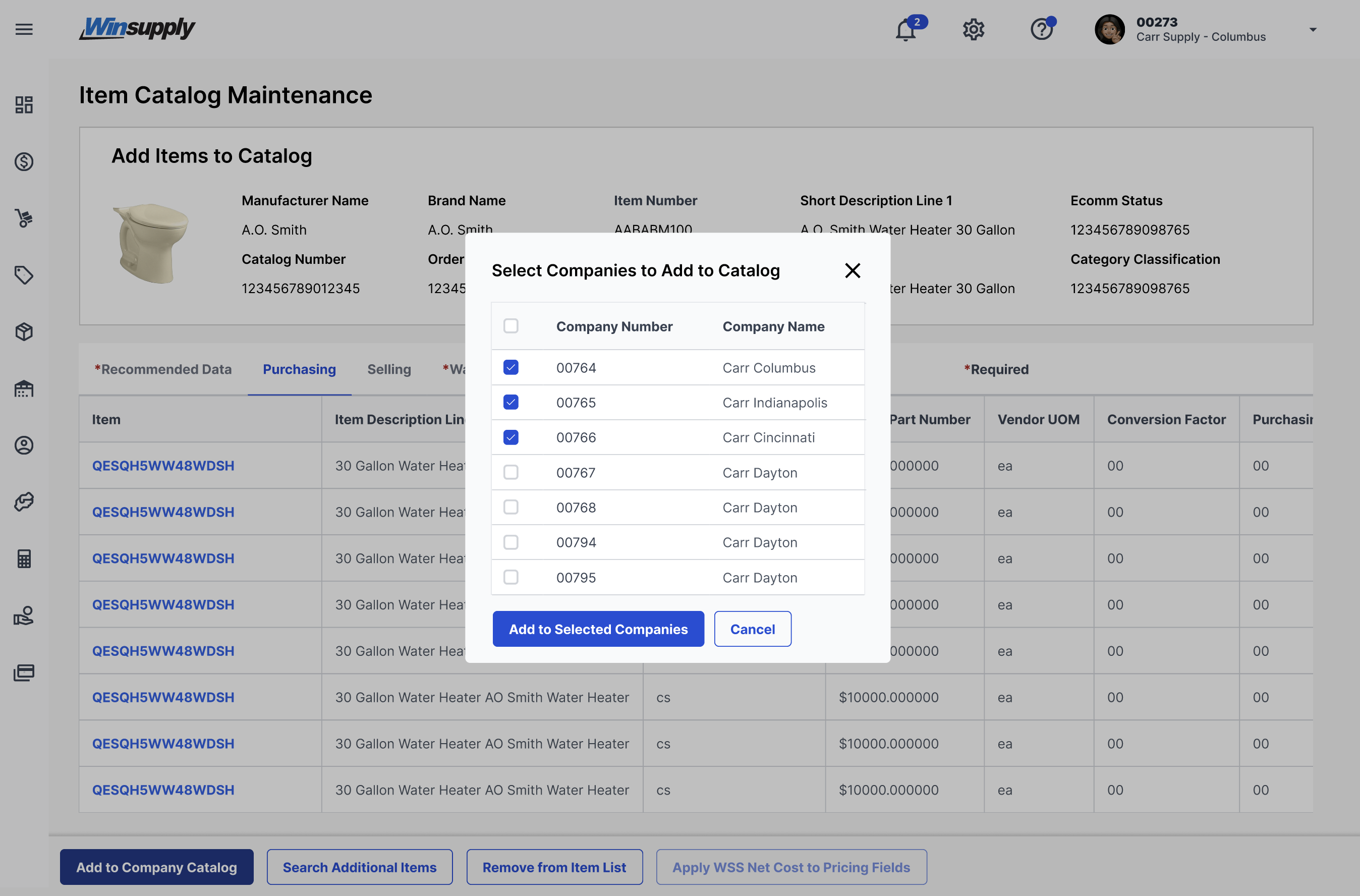
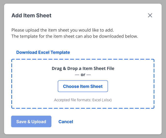
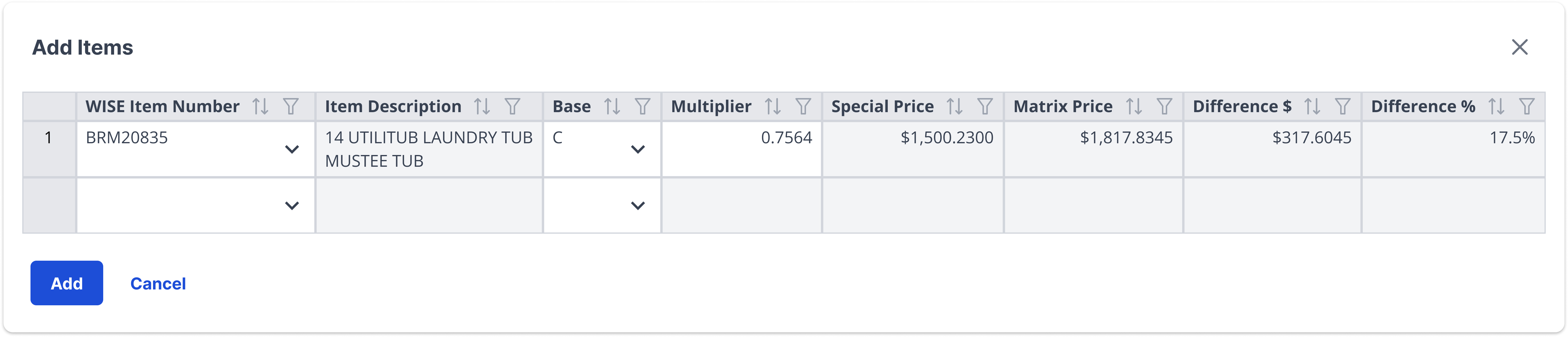
Enable the user to close "X" in the top right corner.
Example Two
Label the action of the modal in the header.

Example Three
Place the primary button on the bottom left that will confirm the action or change described within the modal.
Example Four
If a primary and destructive button are within the same modal, place the primary button on the bottom left and the destructive button on the bottom right.

Winsupply Standards
Incorrect Usage
Example One
Using a modal where an error or toast message can be used.
Example Two
Stacking modals on top of other modals.

Example Three
Example Four
Variants
Sizing
Applications In Use
No items found.