Dropdown
Purpose
Dropdown (also known as Select) enables users to choose a single item from a list of options. This component can be used to fill out forms and to filter/sort content.

Usage
When to use
- Filling out forms
- Filtering
When not to use
- There are two or less options to choose from (use radio button)
- Multiple options need to be chosen at the same time (use Multi-Select)
- Displaying complex information
Video Recap
Best Practice
Example One
Keep text concise so the user can get a quick understanding of the options.
Example Two
The focus state should remain on the option selected within the dropdown. This helps the user track where they are in the list if they were to close and re-open the dropdown.
Example Three
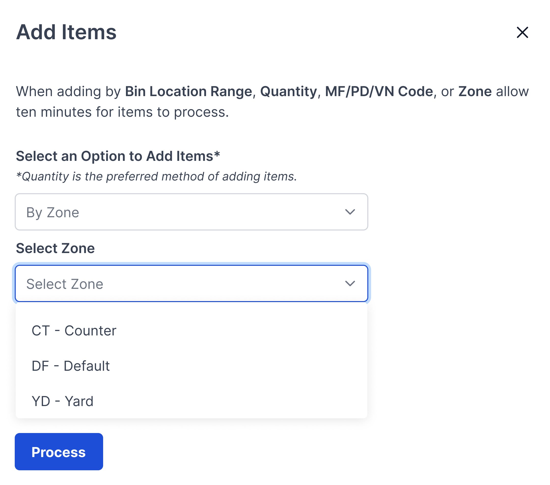
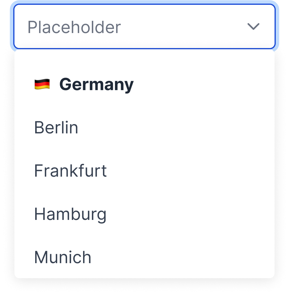
If the dropdown contains 15 or more options, enable the filtering feature. This gives the user the opportunity to find the appropriate option faster than scrolling.

Example Four
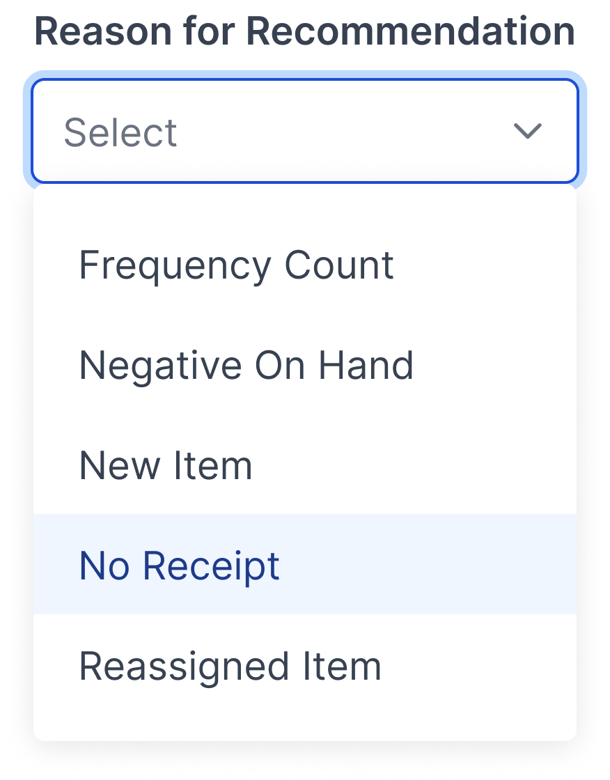
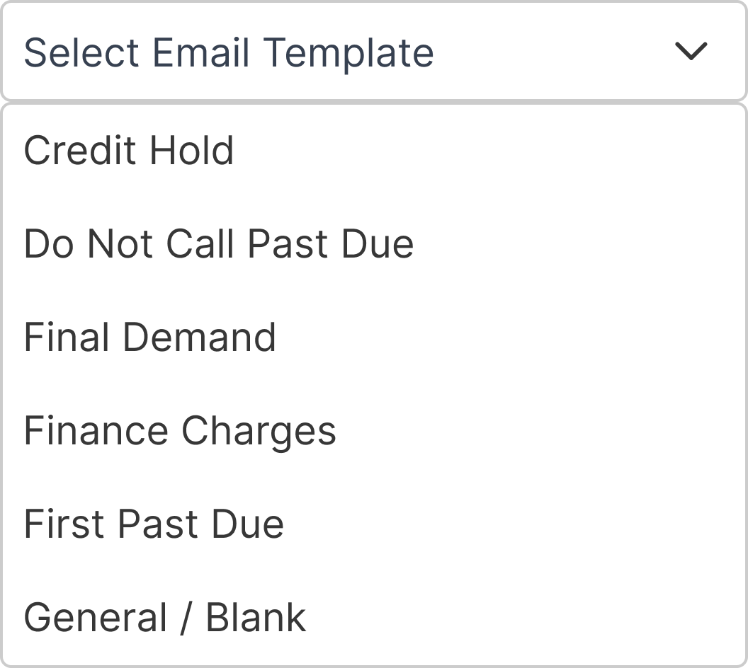
Place list of options in alphabetical/numerical order.
Winsupply Standards
Incorrect Usage
Example One
There are less than two available options.

Example Two
Hiding complex information within the dropdown.
Example Three
Example Four
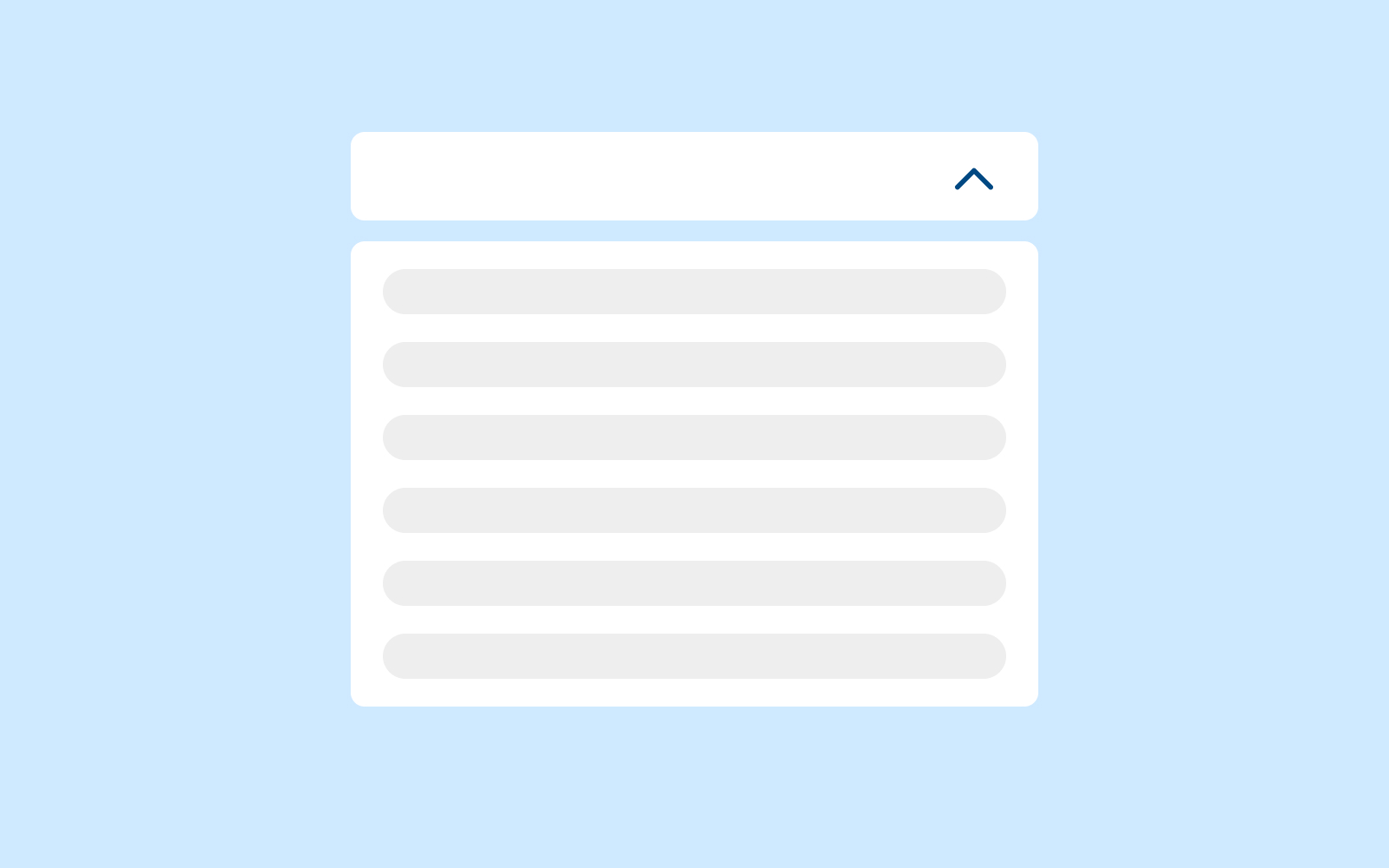
Variants
Templating/grouping
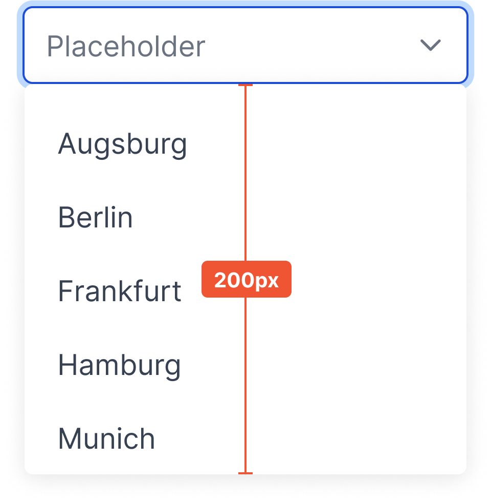
Sizing
Input height: 36px (desktop), 48px (mobile)

Dropdown max height: 200px