
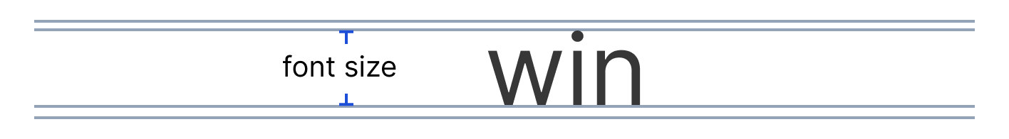
Typography
Our chosen font family is clean and readable at all scales, which can be easily used to create hierarchy and organization across all applications.
Typeface: Inter
Inter is one of the world's most used typefaces, with applications ranging from computer interfaces, advertising, and airports to NASA instrumentation and medical equipment. The smaller "text" optical-size designs feature a tall x-height to aid in the legibility of lower-case text, with several contrast-enhancing details like ink traps and bridges. The larger "display" optical-size designs offer clean lines, smooth curves, and delicate details for an excellent rhythm of large text (Andersson, Inter Font Family).
Source: Inter Font Family
Weight & Sizing
Strategically combining weight and size establishes hierarchy and guidance throughout applications. Bold type brings emphasis to information or labels. Alternatively, pairing a larger type size with regular font weight can rank higher than pairing smaller type with bold weight.
Three different weights are paired with each type size:
Regular (400)
Semibold (600)
Bold (700)
| Style | Size (px/rem) |
|---|---|
| small/regular-400 | 10.5/0.656 |
| small/semibold-600 | |
| small/bold-700 | |
| body/regular-400 | 14/0.875 |
| body/semibold-600 | |
| body/bold-700 | |
| h6/regular-400 | 14/0.875 |
| h6/semibold-600 | |
| h6/bold-700 | |
| h5/regular-400 | 17.5/1.094 |
| h5/semibold-600 | |
| h5/bold-700 | |
| h4/regular-400 | 21/1.313 |
| h4/semibold-600 | |
| h4/bold-700 | |
| h3/regular-400 | 24.5/1.531 |
| h3/semibold-600 | |
| h3/bold-700 | |
| h2/regular-400 | 28/1.75 |
| h2/semibold-600 | |
| h2/bold-700 | |
| h1/regular-400 | 35/2.188 |
| h1/semibold-600 | |
| h1/bold-700 |
Line Height
1.5 (150% of the font size)
Ideal for headlines or when extra white space and readability are needed.
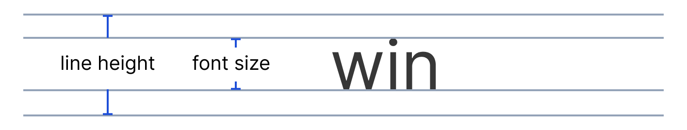
Auto (120% of the font size)
Good for body copy and paragraphs.
1.0 (100% of the font size)
Recommended for when uneven padding values need to be avoided, like in buttons.
Color
Foundational text colors
The foundational text colors are Winsupply/Global/textColor (#374151) and Winsupply/Global/textSecondaryColor (#6B7280).


Winsupply blue
Winsupply/Blue/blue-600 (#2563EB) (1) can emphasize standalone data. Use this treatment on type sparingly so the user does not become distracted from primary actions on the screen.
Winsupply/Blue/blue-700 (#1D4ED8) (2) is the primary blue used in medium and tertiary emphasis buttons and to cue the user that an element on the screen is active.


Additional colors
Text appears in other colors, such as red, green, or yellow, primarily within messaging components or inline error messaging within forms/input fields.
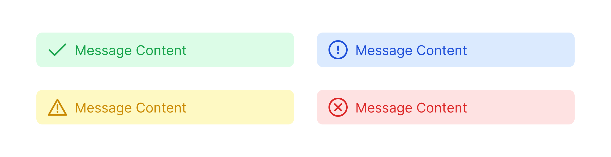
Do not apply green, yellow, or red to standalone text (outside of a component) due to risk of accessibility issues.
Use Cases
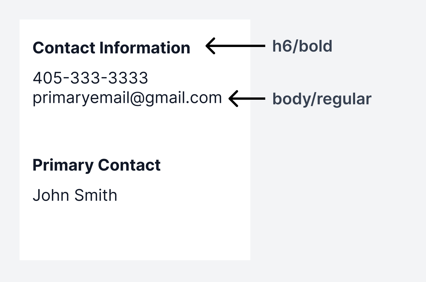
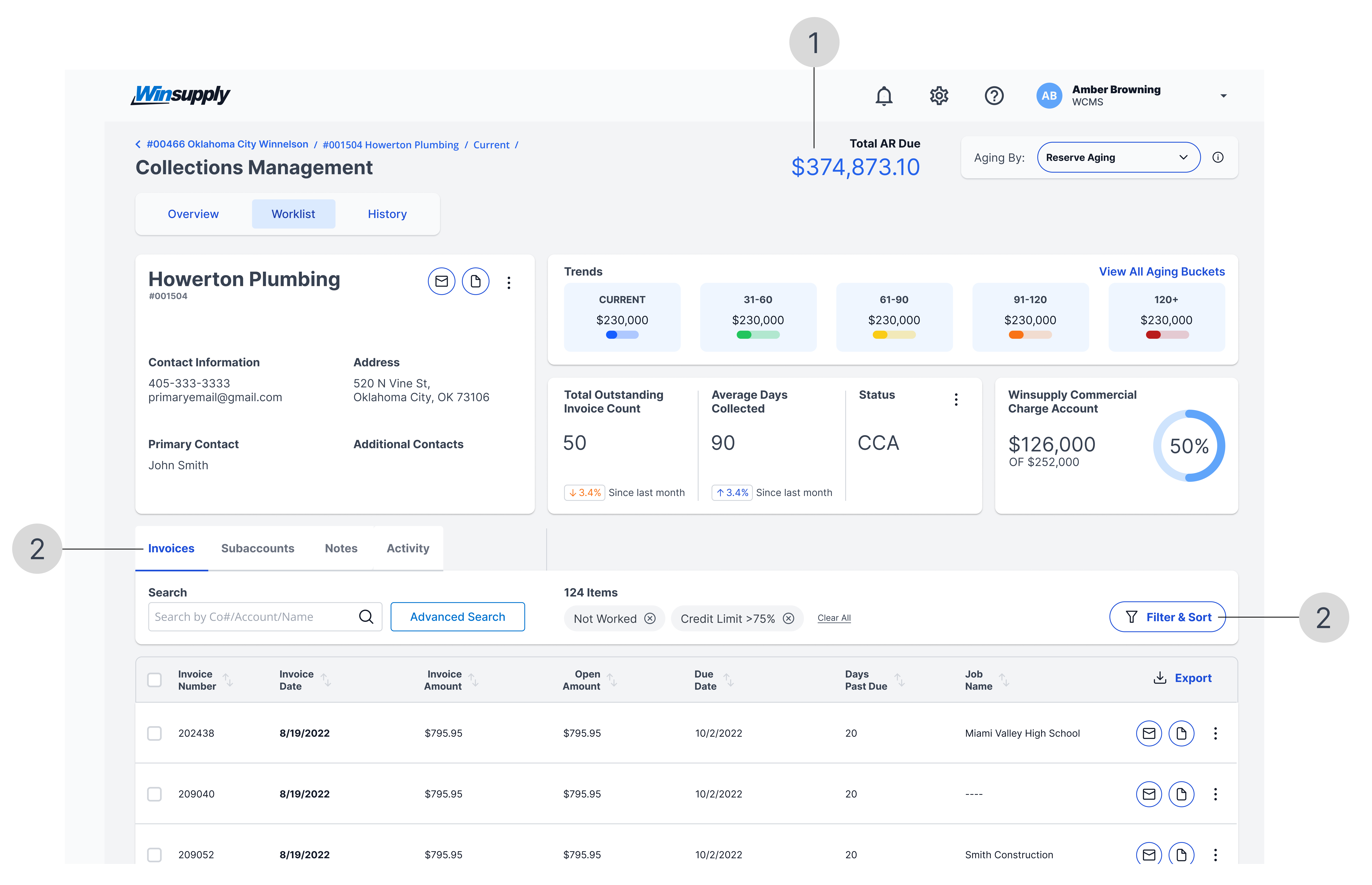
Card
The combined font sizes (h3, h6, and body) and weights create a hierarchy, making the card easily scannable from top to bottom and left to right. This strategy draws attention to important information, such as the customer name and labels.
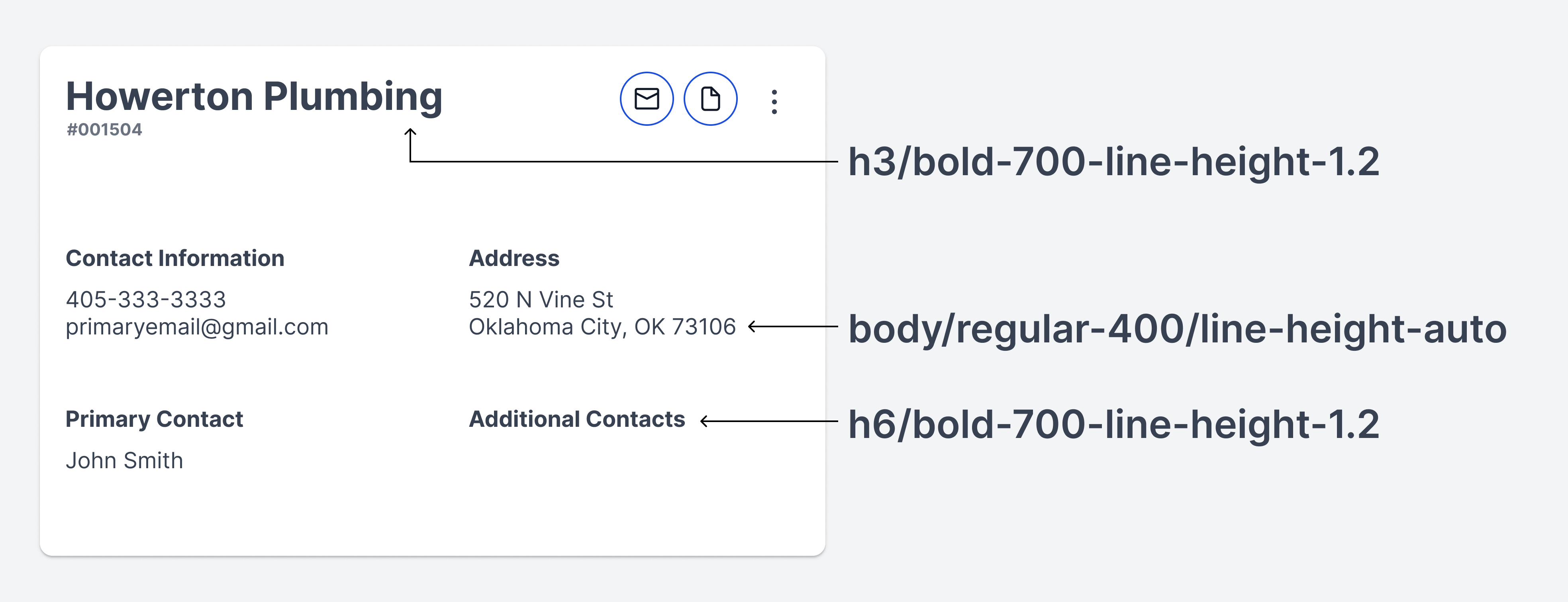
Source: Collections Management
Table
Column headers and table data have the same font size. Bold weight is used on column headers to enable quick understanding of the type of data displayed. The same can be used on high-priority data within a column.
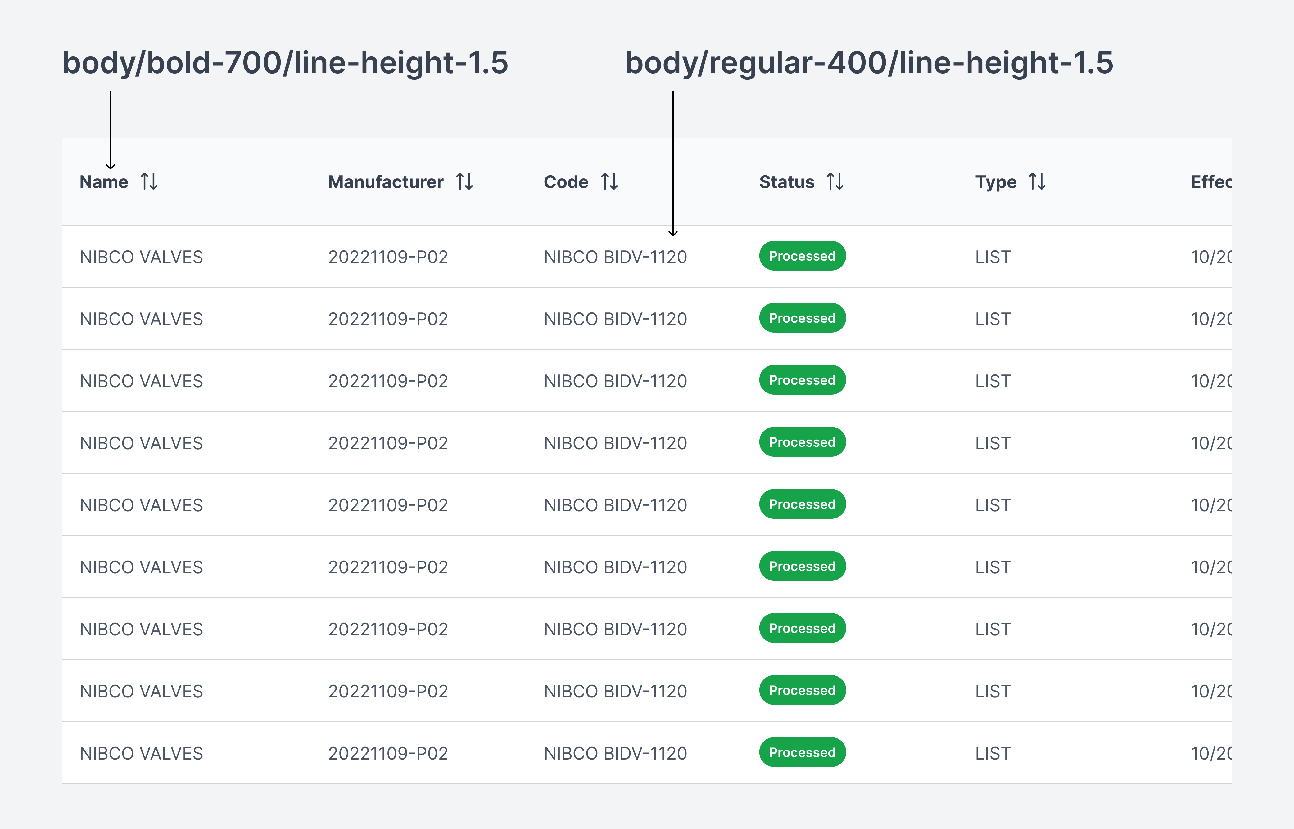
Source: Self Service Price Sheets
Help information
Body text is used to communicate a message.
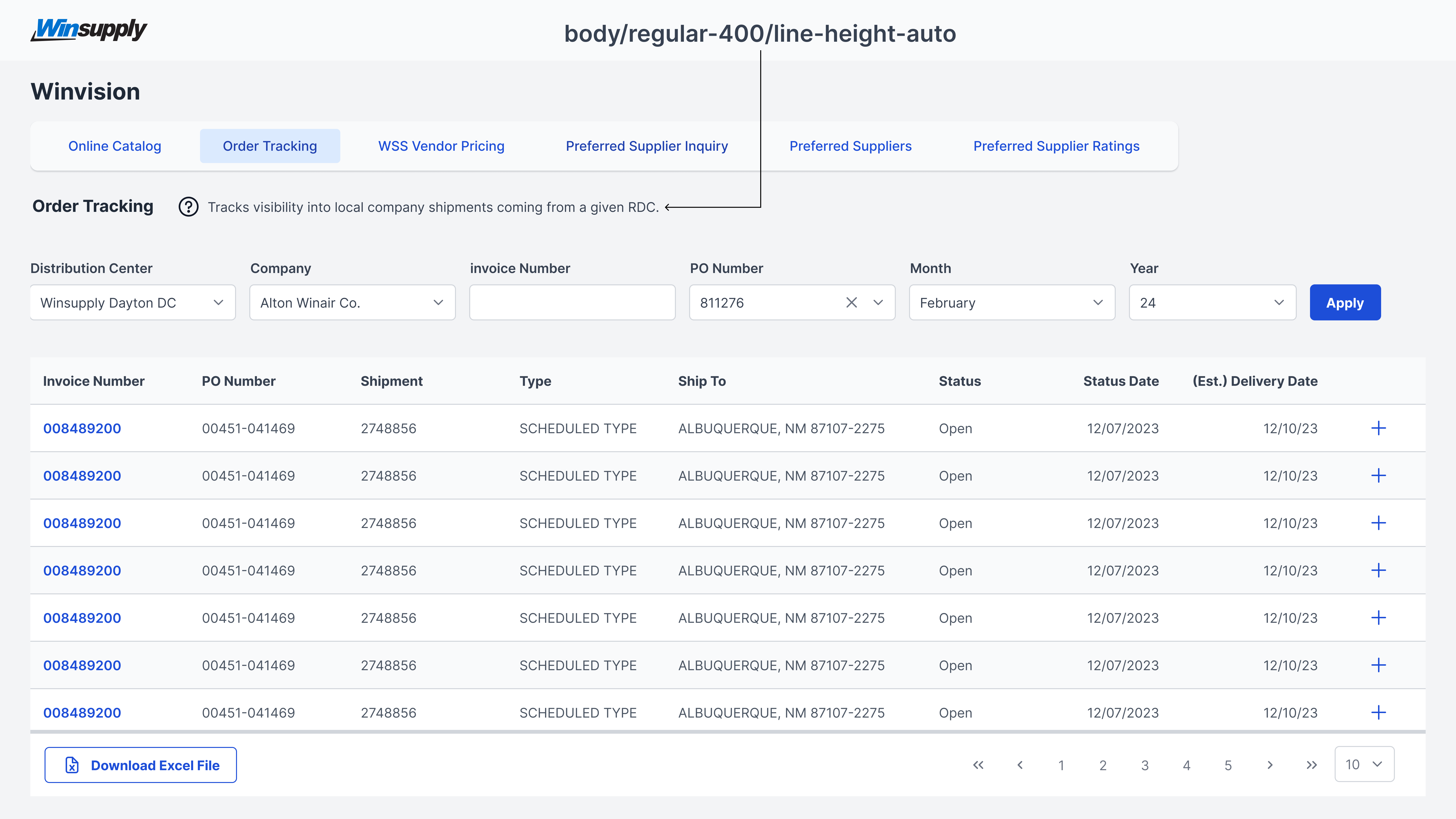
Source: Winvision
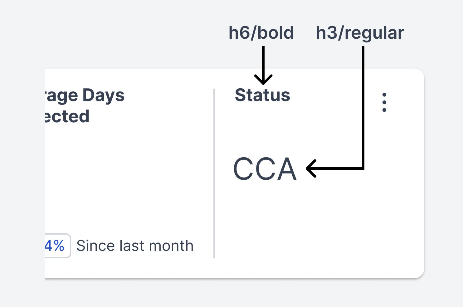
Callout data
H1, h2, and h3 tags makes text stand out due to their larger size. Adding color (blue only) and weight increases emphasis on data within an application. Doing this encourages a user to look at this information first, so they have context before starting a process or task.
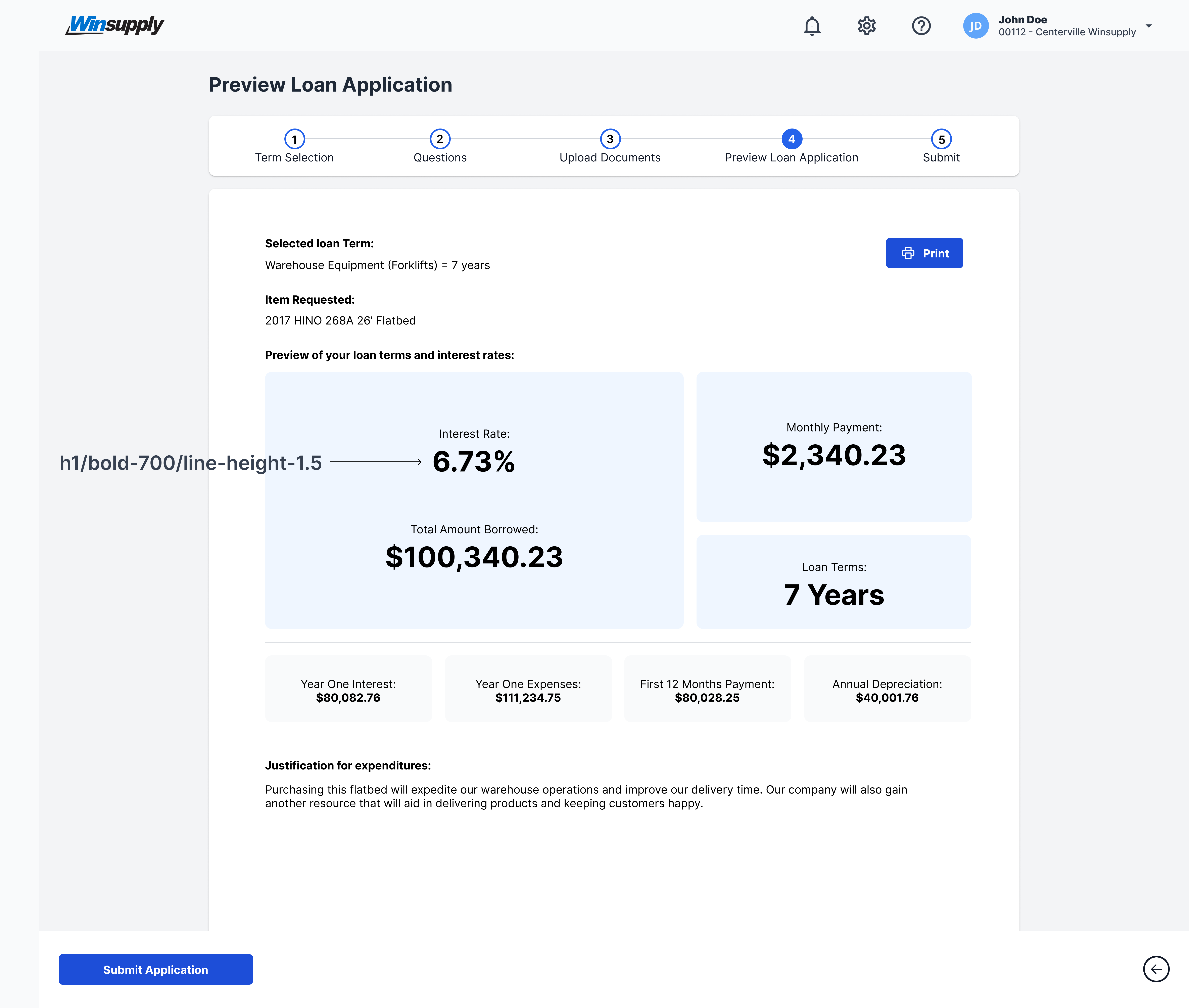
Source: Loans