
InputText
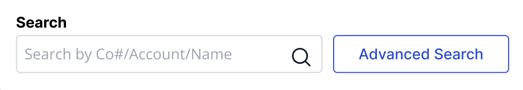
InputText is an extension to an HTML input field with theming and key filtering.

Purpose
The InputText component can be used in fields where the user has full control of what information can be entered. There can also be limitations set for the user to only be able to enter certain information eg. integers.
This component is used within multiple components where users can enter and select data like typeaheads, dropdowns, etc.
Usage
When to use
- Users can enter information freely
When not to use
- Users are required to choose from previously created options
Video Recap
Best Practice
Example One
Adding a title to the field so the users know what they are entering.

Example Two
Example Three
Example Four
Winsupply Standards
Incorrect Usage
Example One
Example Two
Example Three
Example Four
Variants
Default States: Default, Default (Disabled), Error, Error(Disabled)
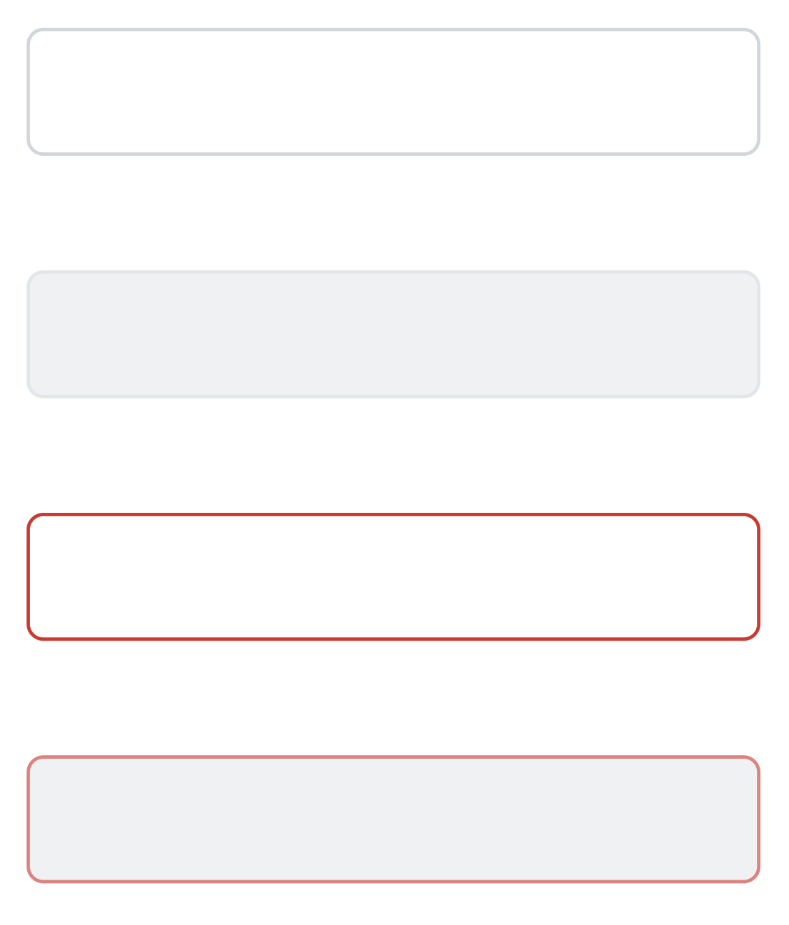
Hover States: Default, Default (Disabled), Error, Error (Disabled)

Focus States: Default, Default (Disabled), Error, Error (Disabled)

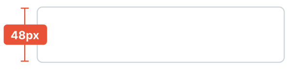
Sizing
Height: 36px

Mobile height: 48px
Related Components


Applications In Use
No items found.