
Card

Purpose
A card is a flexible container that displays summarized information, actions, and/or elements related to a single topic.

Different combinations of elements can be used within cards to display information:
- Header (Image (image can run to the edge or be placed within 16px padding, see sizing below))
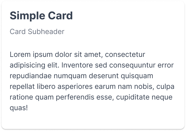
- Title
- Subheader
- Content
- Footer
Cards can contain additional components such as buttons, charts, graphs, dividers, input fields, chips, tables, etc. Ensure hierarchy is established to enable a user to quickly scan and understand content.
Usage
When to use
- Information, action, or element are related to the same topic
- Create visual separation/hierarchy amongst large amounts of information
- Contain elements such as a an image, table , chart, or graph
When not to use
- Information, action, or element is not related
- More detail is required than a high-level summarization
Video Recap
Best Practice
Example One
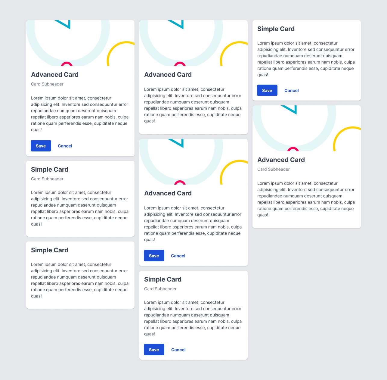
If displaying multiple cards in the same area, place and size them to be in a grid format.
Example Two
Use cardShadow as a drop shadow effect to differentiate a card from other elements.

Example Three
Example Four
Winsupply Standards
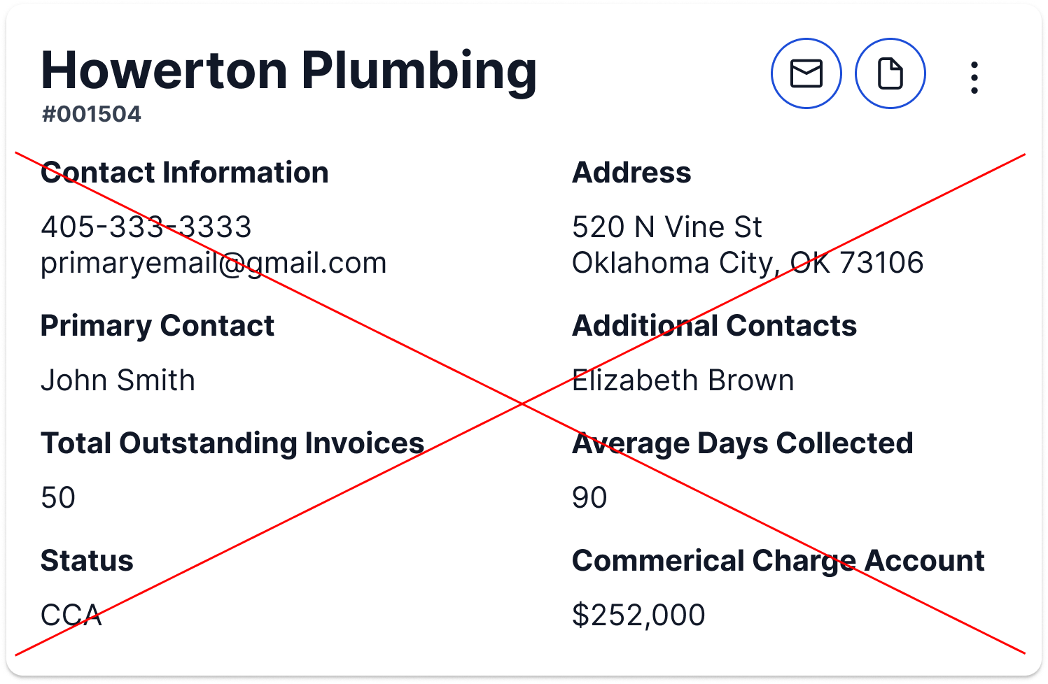
Incorrect Usage
Example One
Using a card as a modal (See Dialog (Modal)).

Example Two
Overwhelming the space with content.
Example Three
Example Four
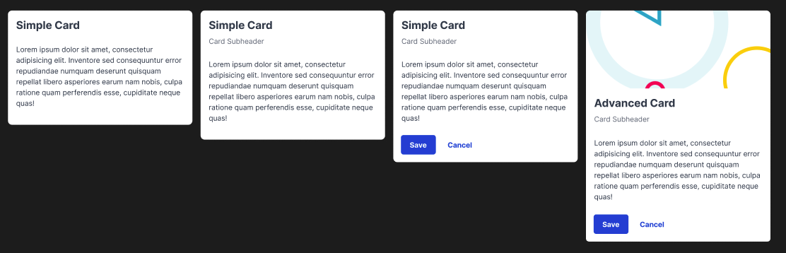
Variants
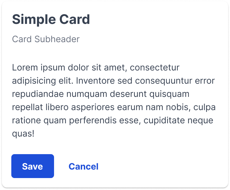
Card with subheader
Card with subheader and footer
Advanced card: header (image), subheader, and footer
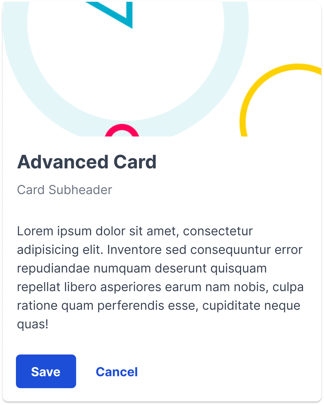
There are multiple combinations between the header, subheader, and footer that can be used as variants. The previous three variants are examples of adding an additional element onto each card.
Sizing
16px padding and 8px spacing between elements within the card. Advanced card is split into usercard and content. Usercard has 0px padding and content has 16px padding.
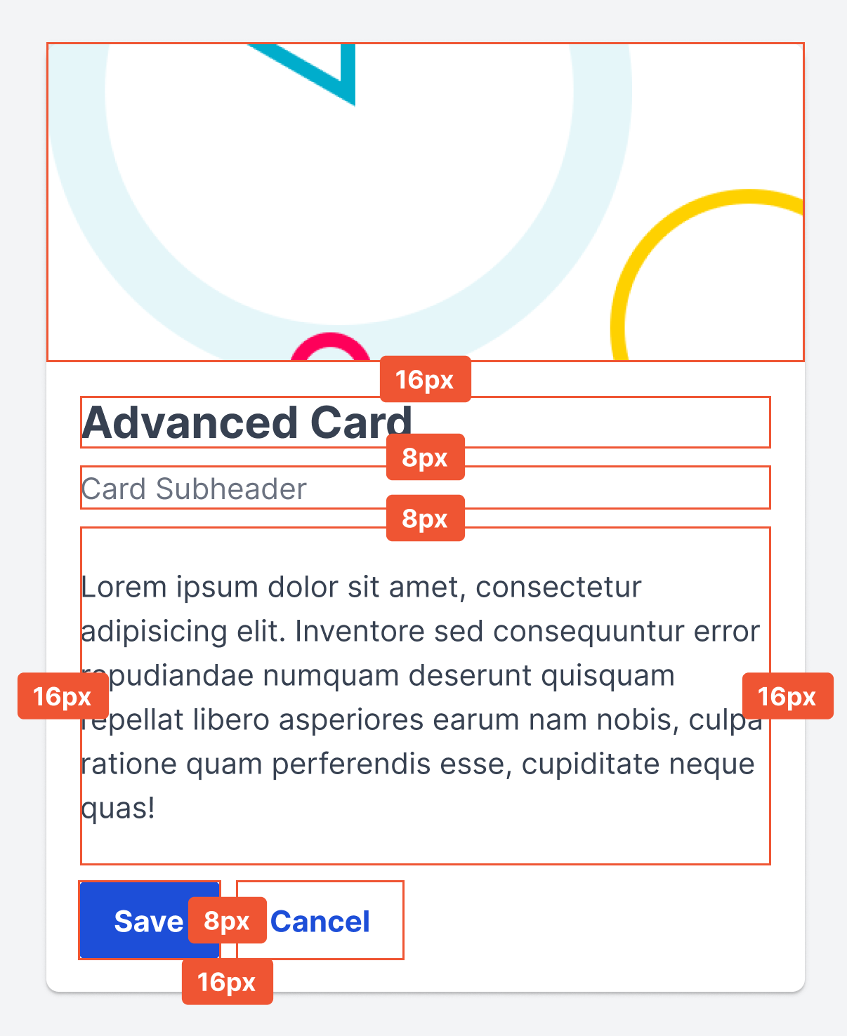
16px margin
