
Form Validation
Providing validation and feedback while users interact with and fill out forms is crucial. It plays a significant role in ensuring that users can easily understand successes and recover from errors before submitting information.
Best Practice
Use noticeable, redundant, and accessible indicators
Be specific
Clearly communicate what went wrong and how users can fix the error.
Highlight the problem
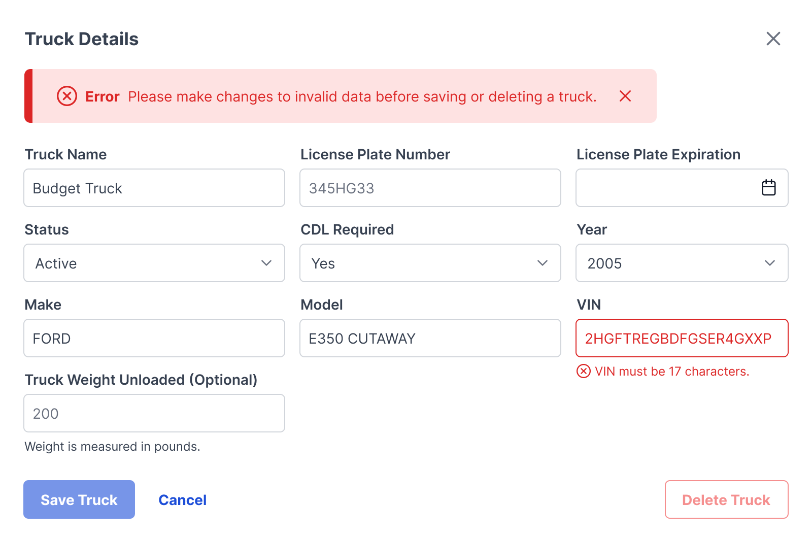
Use visual cues such as color and icons to draw attention to the error message.
Validation
Real-time feedback
Provide instant feedback once a user inputs data, indicating whether the input is valid or not.
Communicate status
Indicate the validation status of input fields using color coding (green for valid, red for invalid) and icons.
Prevent submission
Disable form submission until all required fields are filled correctly.
Concisely and precisely describe the issue
Use plain language
Avoid technical jargon and use language that is easy for users to understand.
Offer constructive advice
Provide solutions
Offer actionable solutions to help users recover from errors.
Offer undo options
Allow users to undo their actions to rectify errors.
Save user input
Automatically save user input to prevent data loss in case of an error.
Safeguard against likely mistakes
Clear instructions
Provide clear and concise instructions to help users avoid errors.
Smart defaults
Use default settings and suggestions to guide users in providing correct input (Ex. Calendar (date picker) component). Add helper text below input fields when necessary to inform users of format or other requirements.
Consistency
Uniform design
Maintain consistency in the design and placement of error messages throughout the application.
Error messages
Messaging must be noticeable and recognizable to users through the use of the same colors, labels, and icons.
Color
Choosing the right color is crucial for effectively communicating severity and guiding users to a resolution or the next step. Follow Messaging guidelines when communicating warnings, success, and information. Only error color may be used on helper text below input fields to convey invalid responses. An icon must be present to aid in further conveying status/severity.

Error
Global color token: Winsupply/Red/red-600
- Error messages
- Invalid input fields
- Critical system errors
Warning
Global color token: Winsupply/Yellow/yellow-600
- Caution messages
- Non-critical system errors
Success
Global color token: Winsupply/Green/green-600
- Valid input fields
- Confirmation message after error resolution
- Confirmation of saved data
- Successful submission of data
Information
Global color token: Winsupply/Blue/blue-700
- Informational messages
- Tips or suggestions to prevent errors
Accessibility
Contrast requirements
The combination of text and background color should not fall below the WCAG recommended threshold ratio of 4.5:1 for standard text and 3:1 for larger text (disabled states do not have contrast requirements).
Avoid using color alone to convey information
Always include clear text labels and icons in tandem with color.
Consider users with color vision deficiencies
Ensure the design remains understandable without relying on color alone.