Tooltip
Purpose
A tooltip is a short, informative message that appears when a user interacts with an element in a graphical user interface (GUI). Tooltips are typically triggered by mouse hover or keyboard hover actions. They can be attached to any active element on a page, such as icons, text links, and buttons. Tooltips provide descriptions or explanations for the specific element they are linked to. Consequently, tooltips are highly contextual and focused rather than explaining the overall workflow or providing broader context.
Usage
When to use
- To expose names of controls, like icon buttons, that lack visual labels
- When an element can receive focus, providing additional information aids users in making decisions
- When an element needs more context or explanation
- Use when defining a term or inline item
When not to use
- Since a tooltip disappears when a user hovers away, do not include information for the user to complete their task. Use helper text that is always visible and accessible for vital information, such as required fields.
- Do not include interactive elements within a tooltip. Interactive elements in tooltips are inaccessible for some users and are hard to use for all users since tooltips need to receive focus.
Video Recap
Best Practice
Example One
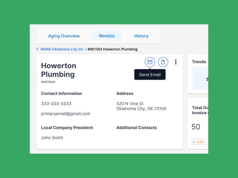
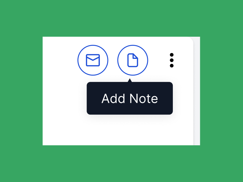
Provide brief and helpful content inside the tooltip.
Example Two
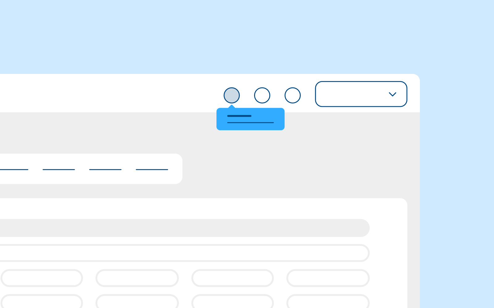
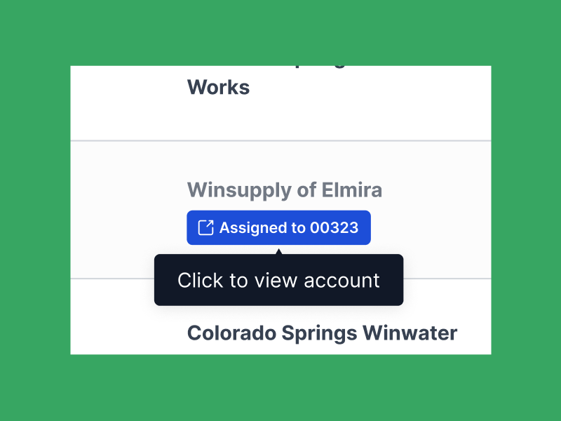
Use tooltip arrows when multiple elements are nearby.
Example Three
Support both mouse and keyboard hover.
Example Four
Winsupply Standards
Incorrect Usage
Example One
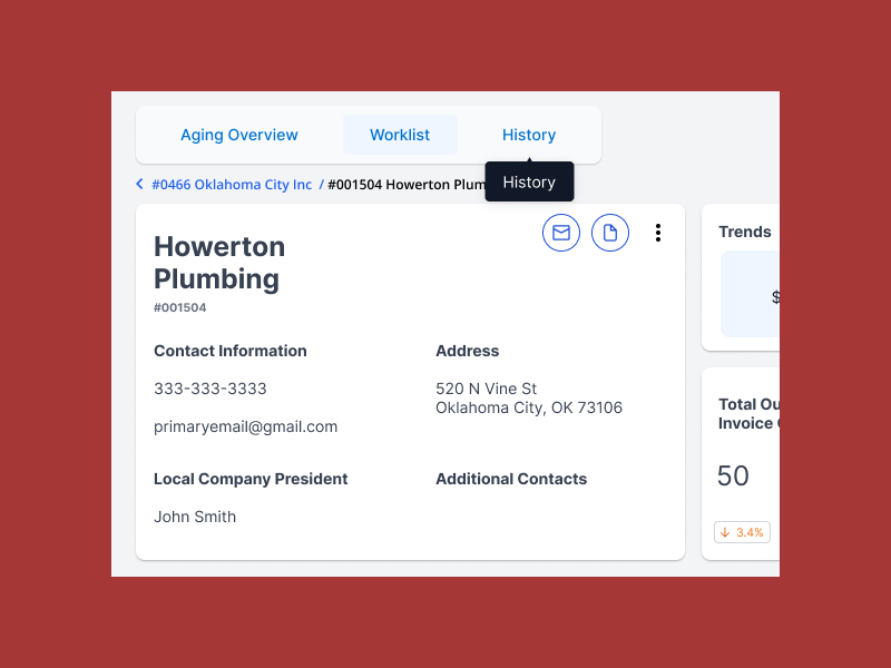
Repetitive and unnecessary tooltip. A tab button with the label History also has a tooltip with the text History.
Example Two
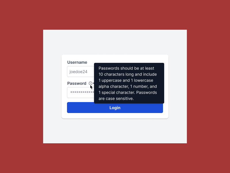
Hiding essential information for the user to complete their task.
Example Three
Example Four
Variants
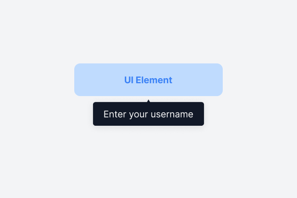
UI Element is UP
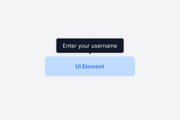
UI Element is DOWN
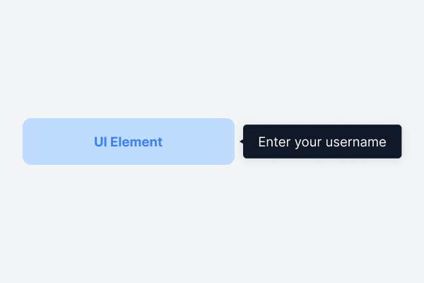
UI Element is LEFT
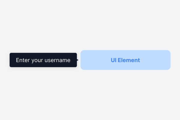
UI Element is RIGHT
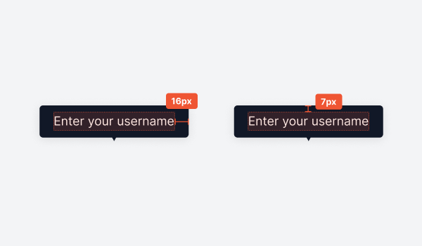
Sizing
Padding: 7px, 16px, 16px, 7px