Select Button
Purpose
A select button is used to switch between opposing, or even multiple, options. They are generally used for contextual states meaning it only affects the current screen the user is on. In addition, they help reduce cognitive load on the user.

Usage
When to use
- When two or more selections can be made
- When there is an immediate effect that will take place, such as:
- changing the order or visibility of a list
- switching views
- changing the format of the content
When not to use
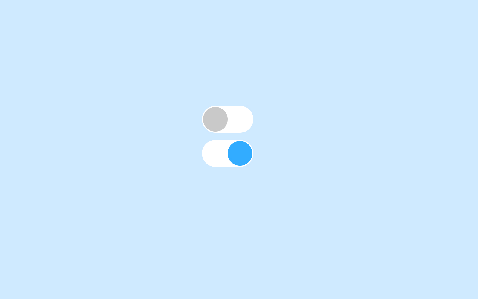
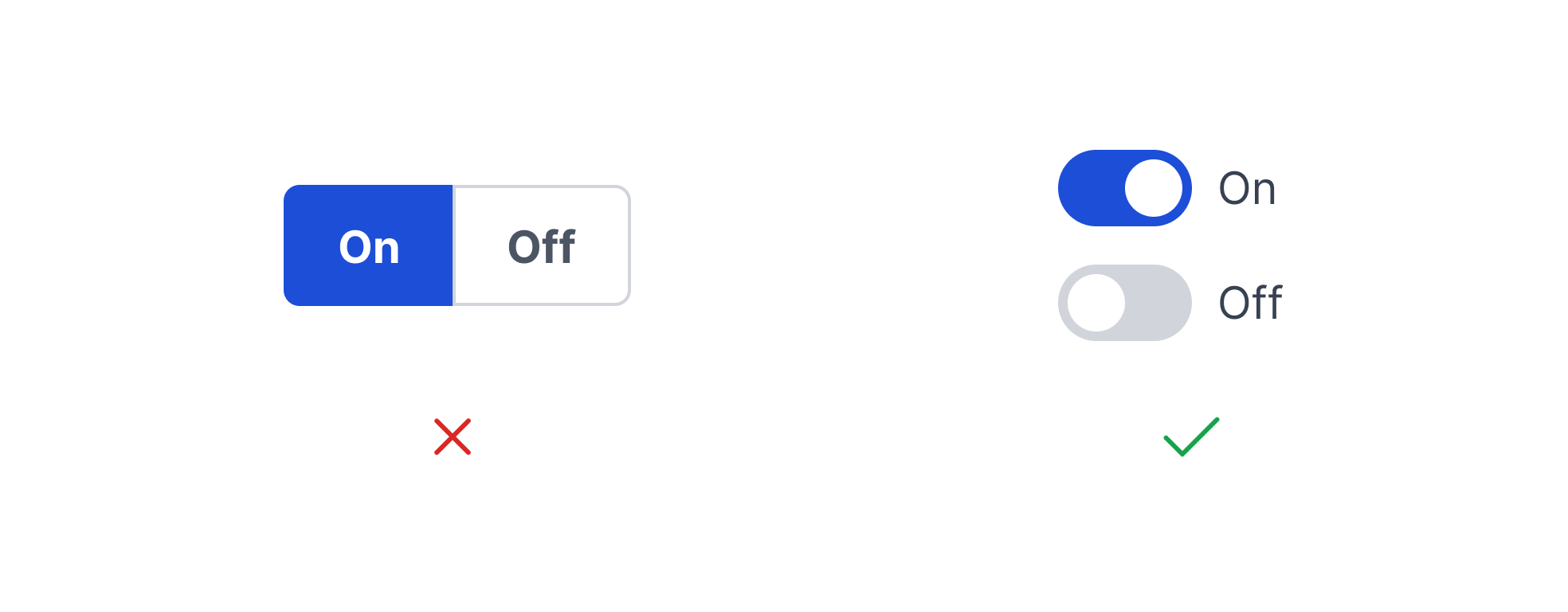
- If the options are binary (ie. on/off), use a toggle switch. Toggle switches are best used for opposite options.
- When there are more than 5 options to choose from. If this is the case, consider using a radio button or checklist component.
Video Recap
Best Practice
Example One
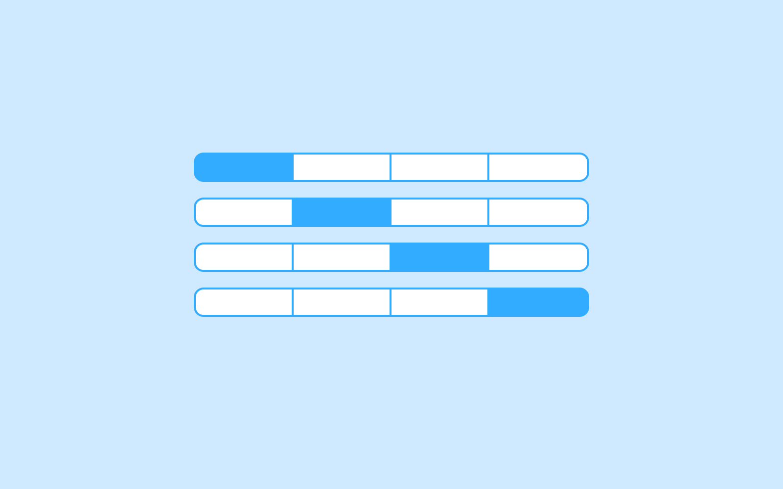
Select buttons should have a default state applied to them. In doing so, it is clearer to the user that an option needs to be selected within this component.

Example Two
When changing the visibility of a list, use a select button.
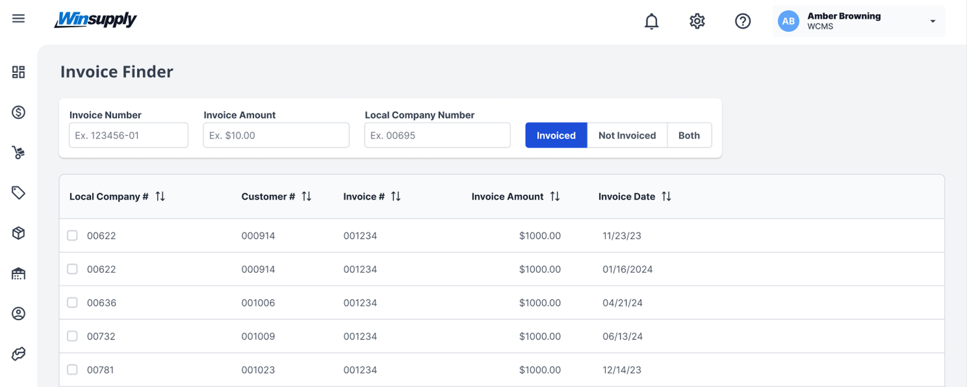
Example Three
Example Four
Winsupply Standards
Incorrect Usage
Example One
Do not use a select button when the options are opposing states, or binary options. For example, on and off are binary options. An input switch is the correct component to use for this case.
Example Two
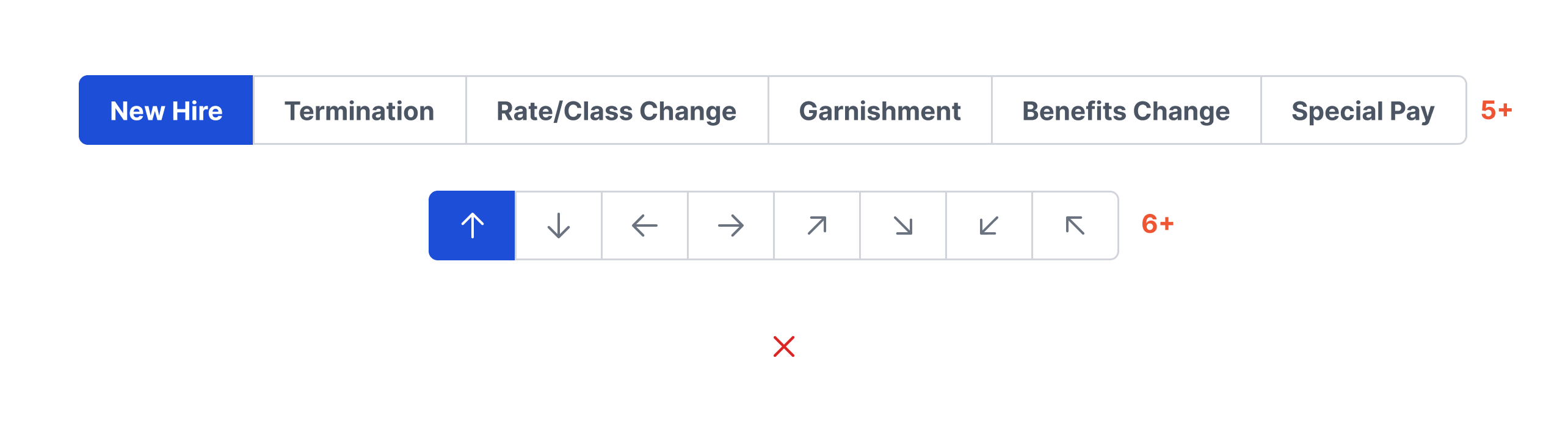
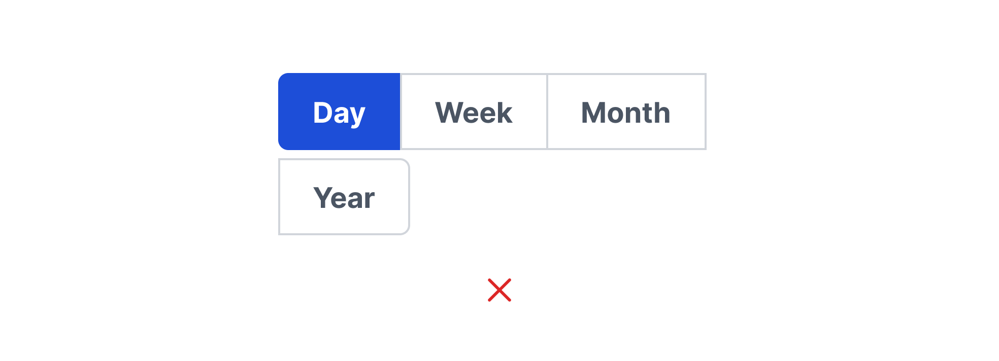
Do not use a select button for more than 5 text-only options and no more than 6 icon-only options.
Example Three
Do not wrap select buttons to multiple lines.
Example Four
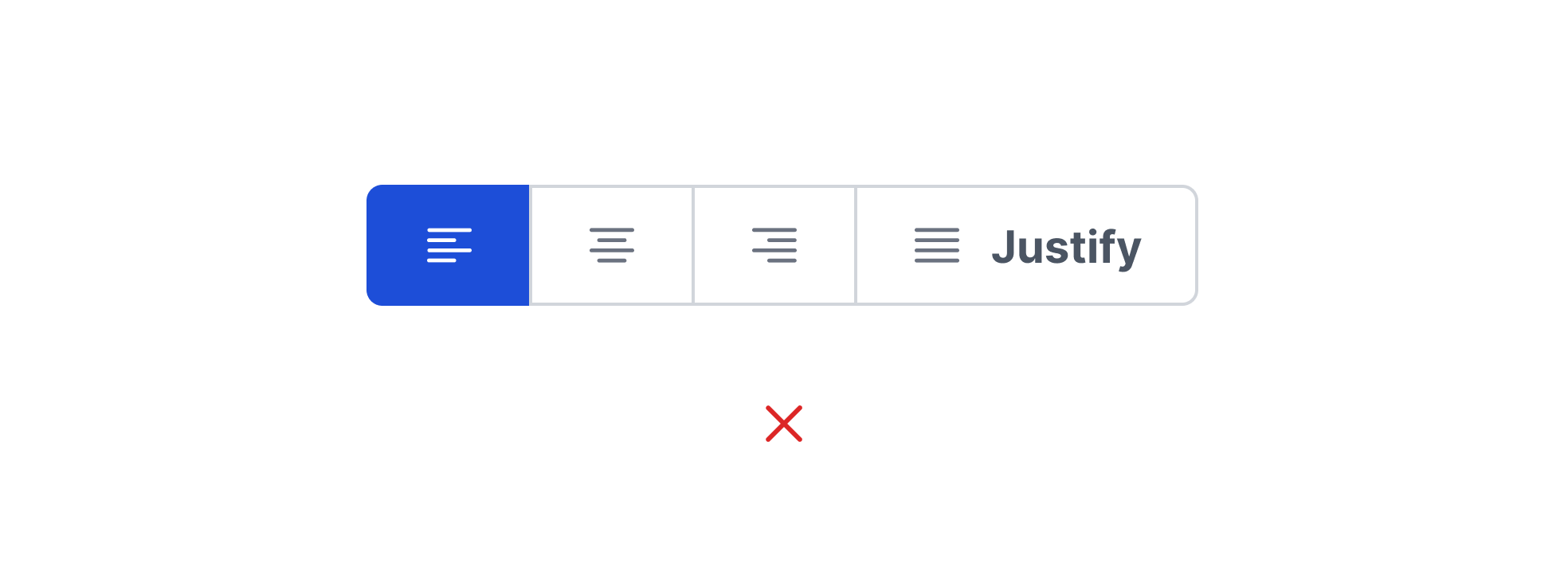
Avoid mixing icon-only options with text labels.
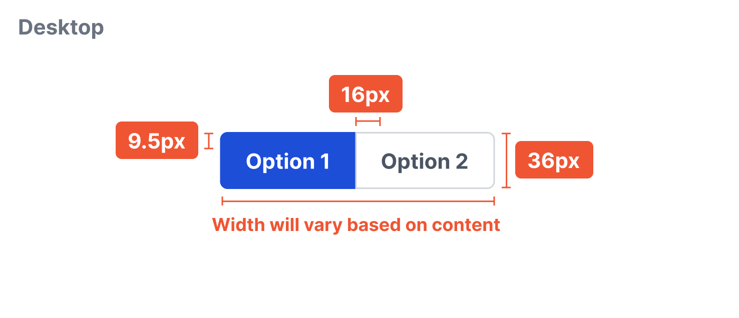
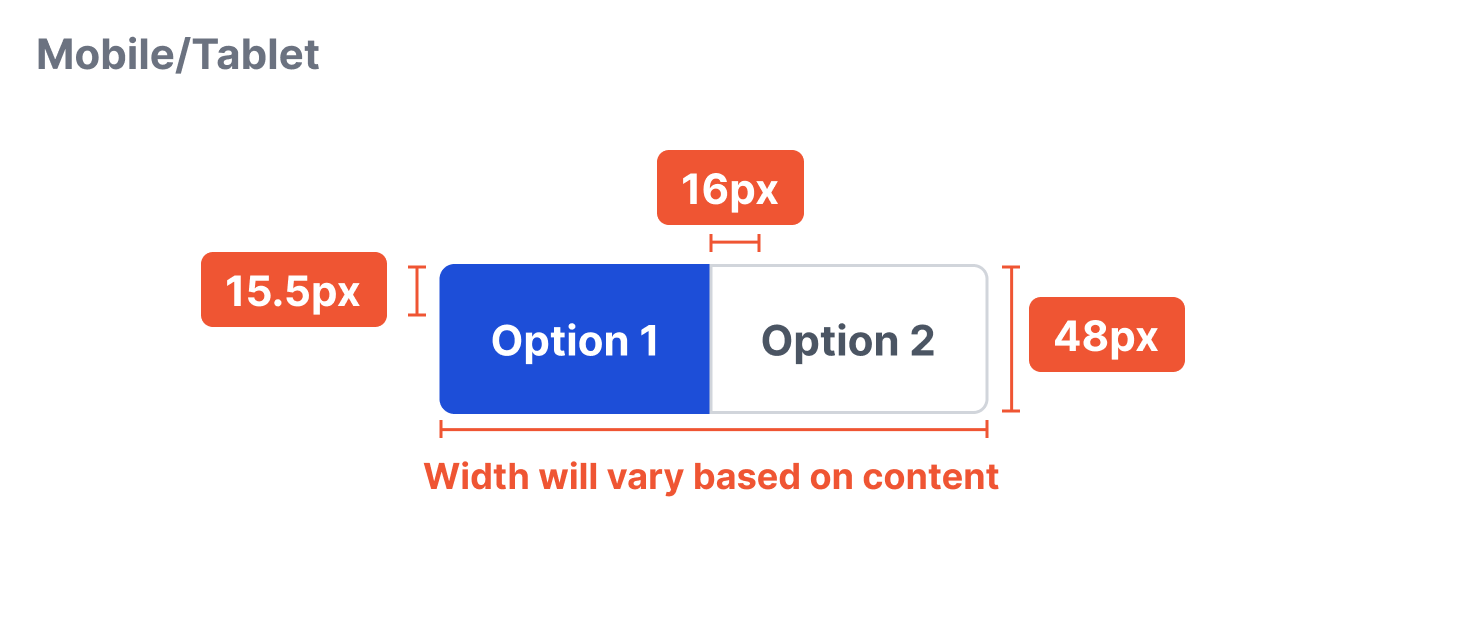
Variants
Sizing
The width will vary depending on the number of options and the content within those options. Be mindful to character amount as long text-only option may increase cognitive load. The height is a fixed 36px.