Icons
Simple, functional icons to use across the Winsupply Local Company facing applications.
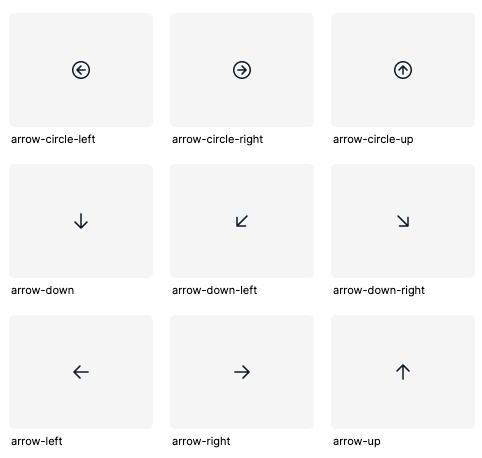
Library
Appearance
We exclusively use outlined icons in our designs due to their versatility and minimalist structure, which ensures they remain unobtrusive and keep the focus on the content. Their clean, simple lines provide a modern aesthetic that complements a wide range of design styles.
Best Practices
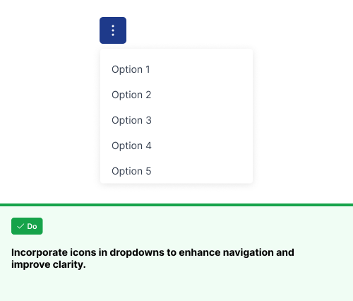
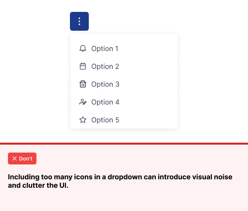
Clear and consistent icon usage is vital in design. Adhering to these best practices ensures uniformity across all Winsupply domains, delivering a cohesive and seamless experience for our users across all products.
Using icons in dropdowns
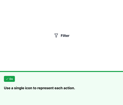
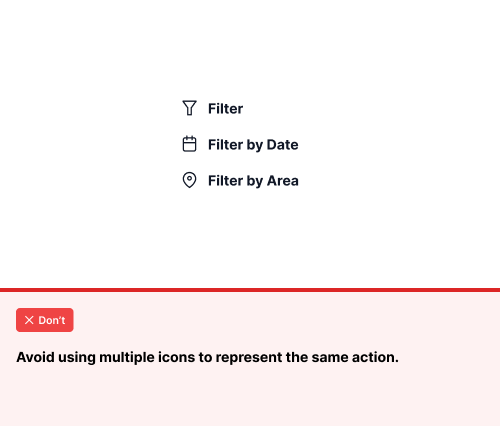
Using a single icon for similar actions
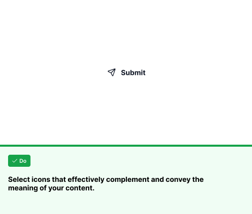
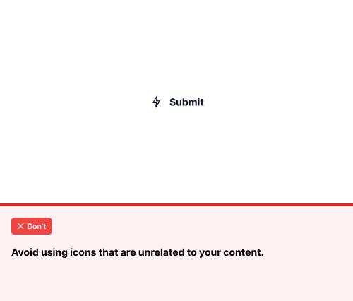
Using icons that complement and convey the correct meaning
How to use Google Material Icons
Designers can also incorporate icons from Google Material Design alongside Prime icons. Google Material Design icons should be used when Prime does not provide the specific icon needed for the design. Refer to the list below for the settings needed to ensure Google Material icons align with the Prime icon styling. You can easily access Google Material Icons by downloading the Material Symbols Figma Plugin.
How to find the Google Material Icon Plugin
To set up your Figma account with the proper plugin to use Material Icons please see the below video
Please watch the video to propery adjust the settings to match the stylization of Prime Icons
Google Material Icon Settings
Open the Material Symbols plugin in Figma
Search for the desired icon and adjust the settings as follows:
Icon Type: Rounded
Weight: 300
Fill: Off
Grade: Normal
Optical Size: 24dp
Color
Stand-alone icons are Winsupply/Surface/surface-900 (#111827), but if placed within a filled (high-emphasis) button or component, color tokens will contain -TextColor. If within a medium or low-emphasis button (outlined or text-only with no background), color tokens will contain -ButtonBg. For consistency and accessibility, an icon must match the label color within a component.The check mark, error, and tooltip icons can be styled with either
Winsupply/Button/buttonbg or Winsupply/Surface/surface 900, depending on the design. Additionally, the delete button can use Winsupply/Button/dangerButtonbg, as well as Winsupply/Button/buttonbg or Winsupply/Surface/surface 900.
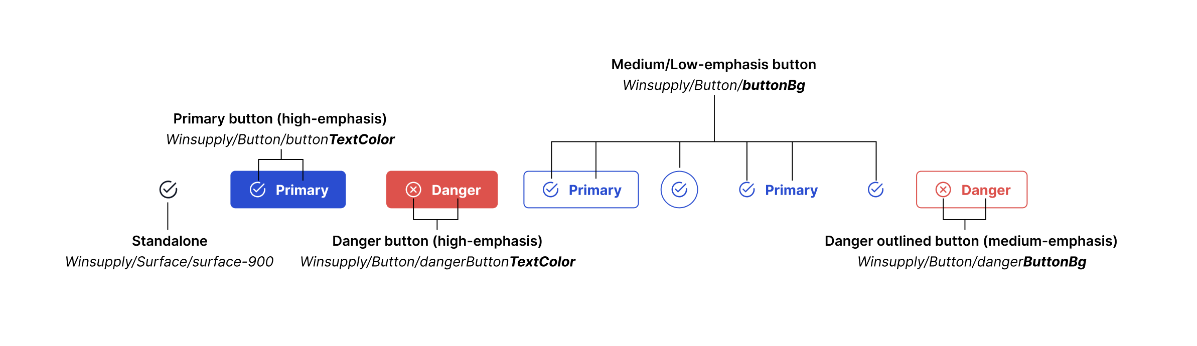
In the WISE Side Panel, icons should use buttonbg as they serve as clickable buttons that provide users access to new information.
Buttons and Icons
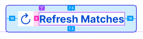
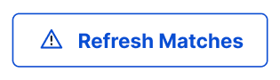
Designers should only use icons when the icon directly relates to or can replace the text within a button and users still understand the desired function. Use default button spacing for icons within buttons
Sizing
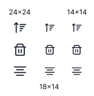
ARC contains three icon sizes 24x24, 14x14, and 18x14. (18x14 for some icons, for example, table sort)
14x14 pixel icons are the small size we design with. These smaller icons are used when space is limited and when designing with smaller components like chips.
24x24 pixel icons are the standard size we design with. You will find 24-pixel icons in the majority of applications at Winsupply.